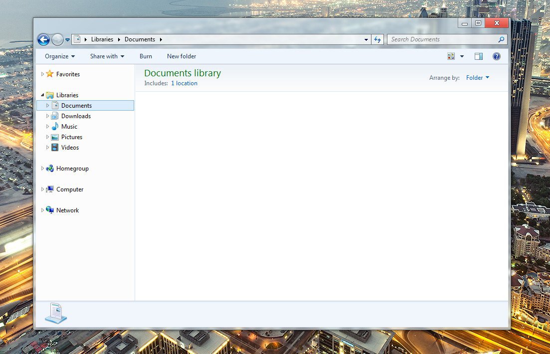
Do you want Aero?

No, metro looks great, the desktop version of metro looks like utter crap to be honest.. I love minimalism but man did Microsoft do it absolutely wrong... Look at a well themed XFCE desktop, looks better than windows 8 Desktop by light years.

A Bland blue for the window and black text is just.. ugh just horrible design.

Light gray plus black works, a mid blue that win8 has plus black equals puke. They should have used a lighter color or allowed us to change it.

I seriously can't wait for windows blinds, win8 needs it a lot more than 7 ever did.
 

My Computer

System One

  • OS
    Windows 8
No, metro looks great, the desktop version of metro looks like utter crap to be honest.. I love minimalism but man did Microsoft do it absolutely wrong... Look at a well themed XFCE desktop, looks better than windows 8 Desktop by light years.

A Bland blue for the window and black text is just.. ugh just horrible design.

Light gray plus black works, a mid blue that win8 has plus black equals puke. They should have used a lighter color or allowed us to change it.

I seriously can't wait for windows blinds, win8 needs it a lot more than 7 ever did.

I don't think I agree. I just upgraded my DEV system a few days ago. I thought I would puke at the appearance of it but it is actually quite nice. Here's a couple shots.

Desktop.png


Metro.png


I originally thought Metro was going to look really bad on a desktop machine but I'm really starting to like it. I haven't installed any 3rd-party GUI enhancements except the Dell Dock which was on my system before the upgrade (and I use constantly).

As you might guess, my "Metro" screen isn't complete. I figure that will be added to gradually as I find myself thinking of things I want to launch from there. I'm in the desktop most of the time. However when I'm done working on something I pop it onto the Metro screen as a kind of screen saver / dashboard. I really thought I'd hate this but I don't.

-Max
 

My Computer

System One

  • OS
    Windows 7 Ultimate 64-bit
    System Manufacturer/Model
    Dell Inspiron 17R / Dell XPS 8300
    CPU
    Intel i5 (17R) / Intel i7 (XPS)
    Memory
    8GB / 8GB
No, metro looks great, the desktop version of metro looks like utter crap to be honest.. I love minimalism but man did Microsoft do it absolutely wrong... Look at a well themed XFCE desktop, looks better than windows 8 Desktop by light years.

A Bland blue for the window and black text is just.. ugh just horrible design.

Light gray plus black works, a mid blue that win8 has plus black equals puke. They should have used a lighter color or allowed us to change it.

I seriously can't wait for windows blinds, win8 needs it a lot more than 7 ever did.

I don't think I agree. I just upgraded my DEV system a few days ago. I thought I would puke at the appearance of it but it is actually quite nice. Here's a couple shots.

Desktop.png


Metro.png


I originally thought Metro was going to look really bad on a desktop machine but I'm really starting to like it. I haven't installed any 3rd-party GUI enhancements except the Dell Dock which was on my system before the upgrade (and I use constantly).

As you might guess, my "Metro" screen isn't complete. I figure that will be added to gradually as I find myself thinking of things I want to launch from there. I'm in the desktop most of the time. However when I'm done working on something I pop it onto the Metro screen as a kind of screen saver / dashboard. I really thought I'd hate this but I don't.

-Max

My complaints about the looks aren't really targeted at the start screen. The start screen tiles actually do use some gradients and many contain some fancy pictures or whatever to make them a little stylish. It's what they did to the desktop mode window decorations that really irks me.
 

My Computer

System One

  • OS
    Windows 8.1 Pro 64-Bit, Ubuntu 13.04 64-Bit
    Computer type
    PC/Desktop
    System Manufacturer/Model
    Custom Built
    CPU
    Intel Core i7 950 @ 3ghz
    Motherboard
    Asus Sabertooth X58
    Memory
    Crucial 6GB DDR3 1066mhz Triple Channel
    Graphics Card(s)
    1GB EVGA GTX 460 SE (Nvidia)
    Monitor(s) Displays
    Dual LG Monitors
    Screen Resolution
    1920x1080, 1280x1024
    Hard Drives
    80GB Intel 320 Series SSD
    640GB WD Caviar Blue
    320GB WD MyBook (converted to Internal SATA)
    1TB Seagate Barracuda
    PSU
    Corsair 650TX 650w
    Case
    CoolerMaster HAF 922
    Keyboard
    Logitech G110
    Mouse
    Logitech G500
    Internet Speed
    20mbps Down, 2mbps Up
My complaints about the looks aren't really targeted at the start screen. The start screen tiles actually do use some gradients and many contain some fancy pictures or whatever to make them a little stylish. It's what they did to the desktop mode window decorations that really irks me.

This is nothing but a theme. Themes can be replaced.

There aren't any third party themes yet, but they should be coming from companies like Stardock. This is one of the silliest arguments ever, since themes are an extension mechanism that Microsoft has built into windows to allow third parties to change the look. This is just the default look.
 

My Computer

System One

  • OS
    Windows 8.1 Pro
    CPU
    Intel i7 3770K
    Motherboard
    Gigabyte Z77X-UD4 TH
    Memory
    16GB DDR3 1600
    Graphics Card(s)
    nVidia GTX 650
    Sound Card
    Onboard Audio
    Monitor(s) Displays
    Auria 27" IPS + 2x Samsung 23"
    Screen Resolution
    2560x1440 + 2x 2048x1152
    Hard Drives
    Corsair m4 256GB, 2 WD 2TB drives
    Case
    Antec SOLO II
    Keyboard
    Microsoft Natural Ergonomic Keyboard 4000
    Mouse
    Logitech MX
Yea I was a little harsh, the default is nice and fine, however the black (minimize, maximize, close, and title bar) colors being black just doesn't look right, there's no reason for a red box around the close button. Now, I've never themed for 7 or any version of windows but having black window buttons just doesn't look appealing. The other buttons are all white so why wouldn't the window buttons and title bar text be white as well? There is a theme that does change the title bar text to white but the font he chose isn't for me, the default font is fine, the black text color and window button colors need to be white.

The default theme is actually quite appealing, I was saying black + blue isn't appealing but I wasn't very clear.

No, metro looks great, the desktop version of metro looks like utter crap to be honest.. I love minimalism but man did Microsoft do it absolutely wrong... Look at a well themed XFCE desktop, looks better than windows 8 Desktop by light years.

A Bland blue for the window and black text is just.. ugh just horrible design.

Light gray plus black works, a mid blue that win8 has plus black equals puke. They should have used a lighter color or allowed us to change it.

I seriously can't wait for windows blinds, win8 needs it a lot more than 7 ever did.

I don't think I agree. I just upgraded my DEV system a few days ago. I thought I would puke at the appearance of it but it is actually quite nice. Here's a couple shots.

Desktop.png


Metro.png


I originally thought Metro was going to look really bad on a desktop machine but I'm really starting to like it. I haven't installed any 3rd-party GUI enhancements except the Dell Dock which was on my system before the upgrade (and I use constantly).

As you might guess, my "Metro" screen isn't complete. I figure that will be added to gradually as I find myself thinking of things I want to launch from there. I'm in the desktop most of the time. However when I'm done working on something I pop it onto the Metro screen as a kind of screen saver / dashboard. I really thought I'd hate this but I don't.

-Max
 

My Computer

System One

  • OS
    Windows 8
The aero in Windows7 was pretty good.. But microsoft removed that from Windows 8 RTM.. Aero in previews was nice with transparency.. But now in RTM there is no transparency...
 

My Computer

System One

  • OS
    Windows 8 Pro 32 Bit
    System Manufacturer/Model
    Dell Alienware X51 Desktop
    CPU
    3rd Generation Intel® Core™ i7-3770 Processor (3.4GHz, 8MB Cache, with Turbo Boost Technology 2.0)
    Motherboard
    Mini-ITX Motherboard
    Memory
    8GB5 Dual Channel DDR3 SDRAM at 1600Mhz
    Graphics Card(s)
    1GB GDDR5 NVIDIA® GeForce® GTX 555
    Sound Card
    Internal High-Definition 7.1 Performance Audio with WAVES MAXX Audio (Standard)
    Monitor(s) Displays
    1
    Screen Resolution
    1366 x 768
    Hard Drives
    1000GB5 SATA hard drive
    PSU
    Alienware™ 330 Watt Power Supply
    Case
    Alienware™ X51 Case
    Cooling
    Alienware™ High-Performance Air Cooling
    Keyboard
    Alienware™ TactX Keyboard
    Mouse
    Alienware™ TactX Mouse
    Internet Speed
    1 MBPS
    Other Info
    Windows 8 Pro on Alienware X51!!! Really Nice!! :-)
The Aero effects in the CP were just right.

The RTM is an abomination visually, but very nice to use.
 

My Computer

System One

  • OS
    Windows 8 Enterprise 64-bit (7 Ult, Vista & XP in V-Box)
    System Manufacturer/Model
    Acer Aspire Ethos AS8951G 'Super-Laptop'.
    CPU
    Intel Sandy-Bridge i7-2670QM quad-core
    Motherboard
    Acer
    Memory
    8GB DDR3
    Graphics Card(s)
    Intel 3000HD / Ge-Force GT555M 2 gigs
    Sound Card
    Realtek/5.1 Dolby built-in including speakers.
    Monitor(s) Displays
    18.4" full-HD
    Screen Resolution
    1920x1024
    Hard Drives
    2x750GB Toshiba internal, 1x500GB Seagate external, 1x2TB Seagate external, 1x640GB Toshiba pocket-drive, 1x640GB Samsung pocket drive.
    PSU
    Stock
    Case
    Laptop
    Cooling
    Air-cooled
    Mouse
    I/R cordless.
    Internet Speed
    Borderline pathetic.
Than use the release preview theme, it still works in RTM but without the glass obviously. We'll probably see some transformation pack sooner or later.
 

My Computer

System One

  • OS
    Windows 8
Than use the release preview theme, it still works in RTM but without the glass obviously. We'll probably see some transformation pack sooner or later.

Or WindowsBlinds 8, they need some newer themes. Half were built for Windows 98! :)
 

My Computer

System One

  • OS
    Windows 8.1 Pro, iOS 7.1, Elementary OS
    Computer type
    Tablet
    System Manufacturer/Model
    Apple
    Memory
    1 GB
    Screen Resolution
    2048x1536
    Other Info
    iPad Air
(3.1) Windows: Colorful
(95,98,ME) Classic: Dull
(XP) Luna: Calm
(Vista) Aero: Class
(7) Aero = Cheesy
(DP,CP,RP) Aero lite = Elegant
(8) Metro = Simple

The styles of Microsoft. :)
 

My Computer

System One

  • OS
    Windows 8.1 Pro, iOS 7.1, Elementary OS
    Computer type
    Tablet
    System Manufacturer/Model
    Apple
    Memory
    1 GB
    Screen Resolution
    2048x1536
    Other Info
    iPad Air
Than use the release preview theme, it still works in RTM but without the glass obviously. We'll probably see some transformation pack sooner or later.

Or WindowsBlinds 8, they need some newer themes. Half were built for Windows 98! :)
Or until there's a way to add transparency without it looking messed up when you move the window.. the rp theme in windows 8 rtm works but no window transparency.
 

My Computer

System One

  • OS
    Windows 8
Well ... after using it for several days I find that it just isn't that big a deal. The appearance is fine. One thing I did notice: without the "glass" effect the text in the caption bars are much easier to read. I guess it's a matter of perspective more than anything else. Not that big a deal.

-Max
 

My Computer

System One

  • OS
    Windows 7 Ultimate 64-bit
    System Manufacturer/Model
    Dell Inspiron 17R / Dell XPS 8300
    CPU
    Intel i5 (17R) / Intel i7 (XPS)
    Memory
    8GB / 8GB
Well ... after using it for several days I find that it just isn't that big a deal. The appearance is fine. One thing I did notice: without the "glass" effect the text in the caption bars are much easier to read. I guess it's a matter of perspective more than anything else. Not that big a deal.

-Max

Same. :)
 

My Computer

System One

  • OS
    Windows 8.1 Pro, iOS 7.1, Elementary OS
    Computer type
    Tablet
    System Manufacturer/Model
    Apple
    Memory
    1 GB
    Screen Resolution
    2048x1536
    Other Info
    iPad Air
(3.1) Windows: Colorful
(95,98,ME) Classic: Dull
(XP) Luna: Calm
(Vista) Aero: Class
(7) Aero = Cheesy
(DP,CP,RP) Aero lite = Elegant
(8) Metro = Simple

The styles of Microsoft. :)

I like Luna ;)

While I definitely preferred (Silver) Luna over the classic themes used in 95~2000/ME, I always thought Luna as a theme looked pretty childish, as in, it looked like a tonka truck theme (especially in the default blue version). It did not take me long to find out about uxtheme patchers and custom msstyles, though. I had some pretty awesome customs for a good chunk of my XP experience. I didn't feel the need to do this in Windows 7, since I thought Aero was so well done in it as the default theme. I was pretty happy. I for one did not find Aero to be cheesy, I thought it looked elegant and beautiful, especially when windows are layered across the desktop.

Windows 8 is on my laptop and I'm still scrambling to find a solution (that works). I did put the RP theme over the RTM one, but with the transparency gone and the inactive windows still turning completely white irregardless of my theme color, it's just not enough. Without the transparency, the borders themselves just look.. flat. I've seen some customs, and most of them don't even let you color-customize. Windowblinds 8, where art thou?
 

My Computer

System One

  • OS
    Windows 8.1 Pro 64-Bit, Ubuntu 13.04 64-Bit
    Computer type
    PC/Desktop
    System Manufacturer/Model
    Custom Built
    CPU
    Intel Core i7 950 @ 3ghz
    Motherboard
    Asus Sabertooth X58
    Memory
    Crucial 6GB DDR3 1066mhz Triple Channel
    Graphics Card(s)
    1GB EVGA GTX 460 SE (Nvidia)
    Monitor(s) Displays
    Dual LG Monitors
    Screen Resolution
    1920x1080, 1280x1024
    Hard Drives
    80GB Intel 320 Series SSD
    640GB WD Caviar Blue
    320GB WD MyBook (converted to Internal SATA)
    1TB Seagate Barracuda
    PSU
    Corsair 650TX 650w
    Case
    CoolerMaster HAF 922
    Keyboard
    Logitech G110
    Mouse
    Logitech G500
    Internet Speed
    20mbps Down, 2mbps Up
Well, like it or not, this is the new windows. :)
 

My Computer

System One

  • OS
    Windows 8.1 Pro, iOS 7.1, Elementary OS
    Computer type
    Tablet
    System Manufacturer/Model
    Apple
    Memory
    1 GB
    Screen Resolution
    2048x1536
    Other Info
    iPad Air
Meh.

After using the Desktop along with the metro apps for months now, I could care less. Actually, it looks weird to me now to see light effected, rounded, and shiny buttons and shiny glassy looking borders. Honestly though, I do think Microsoft should had gone ALL THE WAY in making the Desktop more metro like; such as removing ALL the Aero iconography and replacing it with metro styled ones, should had got rid of the green loading bar in File Explorer, and replaced it with the metro ball horizontal loading animation which would reflect the user's window color choice, they should had used more typography and different font sizes, colors, and weights like Office 2013, speaking of such they should had really made the effort against flattening Aero and focused truly on making window chrome less noticeable. In Office 2013, the main window color is the just a one pixel out line of the window with a colored status bar. You end up not noticing the window controls until you need to use them. I understand though that they couldn't as it would cause issues with vista era programs and other software from displaying correctly.

But overall, I've noticed I don't actually see window chrome or UI controls as much as before. It's just not noticeable to me, as it seems I focus more on the window's content itself versus the window chrome, which is menial compared to what it contains.
 

My Computer

System One

  • OS
    Windows 8.1 Pro
    Computer type
    PC/Desktop
    System Manufacturer/Model
    ASUS
    CPU
    AMD FX 8320
    Motherboard
    Crosshair V Formula-Z
    Memory
    16 gig DDR3
    Graphics Card(s)
    ASUS R9 270
    Screen Resolution
    1440x900
    Hard Drives
    1 TB Seagate Barracuda (starting to hate Seagate)
    x2 3 TB Toshibas
    Windows 8.1 is installed on a SanDisk Ultra Plus 256 GB
    PSU
    OCZ 500 watt
    Case
    A current work in progres as I'll be building the physical case myself. It shall be fantastic.
    Cooling
    Arctic Cooler with 3 heatpipes
    Keyboard
    Logitech K750 wireless solar powered keyboard
    Mouse
    Microsoft Touch Mouse
    Browser
    Internet Explorer 11
    Antivirus
    Windows Defender, but I might go back on KIS 2014
Perhaps they left some aspects of the desktop alone so as to not completely piddle off us curmudgeons who feel that the metro display looks a little over the top..like Liberace.
 

My Computer

System One

  • OS
    Windows 7
    System Manufacturer/Model
    Self-Built in July 2009
    CPU
    Intel Q9550 2.83Ghz OC'd to 3.40Ghz
    Motherboard
    Gigabyte GA-EP45-UD3R rev. 1.1, F12 BIOS
    Memory
    8GB G.Skill PI DDR2-800, 4-4-4-12 timings
    Graphics Card(s)
    EVGA 1280MB Nvidia GeForce GTX570
    Sound Card
    Realtek ALC899A 8 channel onboard audio
    Monitor(s) Displays
    23" Acer x233H
    Screen Resolution
    1920x1080
    Hard Drives
    Intel X25-M 80GB Gen 2 SSD
    Western Digital 1TB Caviar Black, 32MB cache. WD1001FALS
    PSU
    Corsair 620HX modular
    Case
    Antec P182
    Cooling
    stock
    Keyboard
    ABS M1 Mechanical
    Mouse
    Logitech G9 Laser Mouse
    Internet Speed
    15/2 cable modem
    Other Info
    Windows and Linux enthusiast. Logitech G35 Headset.
I'm currently using a visual style for W7 which is exactly what Microsoft should have done with Aero Glass. The squared edges really change the entire feel and the shadows are not as dark. I think it looks so much nicer than the boring abyss that is W8.


AeroW8.jpg
 

My Computer

System One

  • OS
    Windows 7 Home Premium 64-bit
    CPU
    Intel Core i7 2600K
    Motherboard
    Gigabyte Z68 D3H-B3
    Memory
    8GB G.Skill DDR3 1600 Sniper
    Graphics Card(s)
    nVidia GTX 560Ti ES
    Monitor(s) Displays
    HP w2207h
    Screen Resolution
    1680x1050
    Hard Drives
    640GB Western Digital
    PSU
    Antec 620w
    Case
    Cooler Master Centurion 5
    Cooling
    Cooler Master 212+
    Keyboard
    Microsoft Wireless Optical
    Mouse
    Microsoft Wireless Optical
    Internet Speed
    20Mbps
I do agree that I would prefer that look over what Windows 8 provides. I'm not a fan of the dream and boring interface. I fail to appreciate it's simplicity..at least that is that others tell me.
 

My Computer

System One

  • OS
    Windows 7
    System Manufacturer/Model
    Self-Built in July 2009
    CPU
    Intel Q9550 2.83Ghz OC'd to 3.40Ghz
    Motherboard
    Gigabyte GA-EP45-UD3R rev. 1.1, F12 BIOS
    Memory
    8GB G.Skill PI DDR2-800, 4-4-4-12 timings
    Graphics Card(s)
    EVGA 1280MB Nvidia GeForce GTX570
    Sound Card
    Realtek ALC899A 8 channel onboard audio
    Monitor(s) Displays
    23" Acer x233H
    Screen Resolution
    1920x1080
    Hard Drives
    Intel X25-M 80GB Gen 2 SSD
    Western Digital 1TB Caviar Black, 32MB cache. WD1001FALS
    PSU
    Corsair 620HX modular
    Case
    Antec P182
    Cooling
    stock
    Keyboard
    ABS M1 Mechanical
    Mouse
    Logitech G9 Laser Mouse
    Internet Speed
    15/2 cable modem
    Other Info
    Windows and Linux enthusiast. Logitech G35 Headset.
Back
Top