Will 'normal' Windows users want a Start button for Windows 8?

SweetLabs joins a handful of other companies offering to bring the more familiar Start menu/Button back to Windows 8.

Readers of this blog -- other than my mom (hi, mom!) -- are not normal, regular users. Sorry, you/we are not.

"Normal" users are people who get their work (and play) done on Windows, but who are not techies or those who write about them. They are the people who are not likely to have done any real testing of Windows 8 so far. And they are the people who are either going to love or hate Windows 8 when they get to use it in retail stores for the first time next week.

They are the "regular" people like Lockergnome's Chris Pirillo's dad -- a video of whom attempting to use a test build of Windows 8 went viral. Whether you consider Pirillo's video a page-view stunt or not (I am in the "not" camp), you might want to check out another video of his created in conjunction with startup SweetLabs.

This time, Pirillo captured the reactions of various folks in the University District area of Seattle last month who got to try Windows 8 for their first time. These users were checking it out on laptops with keyboards. Their reactions run from interest, to puzzlement, to nervous laughter (in the case of one woman who identified herself as an admin who is quite conversant with Windows).

Check it out:

Read more at source:
Will 'normal' Windows users want a Start button for Windows 8? | ZDNet
 
Hi there
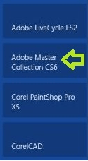
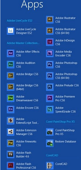
nice try - but how do you actually set this up. --when you install the CS suite you get the tiles as shown in your 2nd screen shot -- so I have to mess around with a lot of fiddling around to group the tiles into some sort of folder.

Most people won't want to do this especially as previous versions of Windows worked just fine (with the start menu).

Cheers
jimbo
 

My Computer

System One

  • OS
    Linux Centos 7, W8.1, W7, W2K3 Server W10
    Computer type
    PC/Desktop
    Monitor(s) Displays
    1 X LG 40 inch TV
    Hard Drives
    SSD's * 3 (Samsung 840 series) 250 GB
    2 X 3 TB sata
    5 X 1 TB sata
    Internet Speed
    0.12 GB/s (120Mb/s)
nice try - but how do you actually set this up

Hello Jimbo. This requires no set up at all. It is done automatically by the Operating System just as happens with the start menu. I said nothing about the Start Screen. The Start Screen is the same thing as a place for desktop icons. You can pin or unpin what you need or don't need from the Start Screen. Groups are automatically created, organized, sorted and labeled in all apps.

http://www.eightforums.com/general-discussion/9789-all-apps-new-start-menu.html?highlight

From the Start Screen - right click and press enter
Program Groups in all apps are reduced to blocks using the zoom feature.

bottom right corner of screen in apps area

zoom.jpg

or press control and roll your scroll wheel
 
Last edited:

My Computer

System One

  • OS
    Server 2012 / 8.0
    Computer type
    PC/Desktop
    System Manufacturer/Model
    Home Built
    CPU
    Intel i7 QuadCore 3770k
    Motherboard
    Asrock Extreme 4
    Memory
    16GB Crucial Ballistix
    Graphics Card(s)
    intel embedded gpu
    Sound Card
    Sound Blaster Z
    Monitor(s) Displays
    AOC / Westinghouse
    Screen Resolution
    1920x1080
    Hard Drives
    Plextor pcie msata
    PSU
    Rosewill Silent Night 500W Fanless / PicoPSU
    Case
    open bench - no case enclosure
    Cooling
    Silverstone HEO2 Passive Silent
    Keyboard
    logitech washable K310
    Mouse
    logitech wired
    Browser
    ie / maxthon
    Other Info
    Totally silent. No fans at all.
Thanks Brink

If you can't do in 8 exactly what you did in Vista or 7, maybe you shouldn't HAVE a computer....

  • Go to "Personalize".
  • Change the following:
    • Font type
    • Icon Size
    • Icon Spacing

Well, it's not quite the same, but hopefully this will help some with that for now.


Thanks for those links. :)

I was aware of the font size and screen multiplier settings.
I suspected that you could "hack" the Registry to adjust other appearance settings.

Can you still "hack" the Registry to change the default font (options 2 and 3 in this tutorial)?
Fonts - Change - Windows 7 Forums

When I reinstalled my operating systems (in September) I repartitioned my HDD and now my W8 VHD won't run, so I can't check.
 

My Computer

System One

  • OS
    Windows 7 Ultimate SP1 (64 bit), Linux Mint 18.3 MATE (64 bit)
    Computer type
    PC/Desktop
    System Manufacturer/Model
    n/a
    CPU
    AMD Phenom II x6 1055T, 2.8 GHz
    Motherboard
    ASRock 880GMH-LE/USB3
    Memory
    8GB DDR3 1333 G-Skill Ares F3-1333C9D-8GAO (4GB x 2)
    Graphics Card(s)
    ATI Radeon HD6450
    Sound Card
    Realtek?
    Monitor(s) Displays
    Samsung S23B350
    Screen Resolution
    1920x1080
    Hard Drives
    Western Digital 1.5 TB (SATA), Western Digital 2 TB (SATA), Western Digital 3 TB (SATA)
    Case
    Tower
    Mouse
    Wired Optical
    Other Info
    Linux Mint 16 MATE (64 bit) replaced with Linux Mint 17 MATE (64 bit) - 2014-05-17
    Linux Mint 14 MATE (64 bit) replaced with Linux Mint 16 MATE (64 bit) - 2013-11-13
    Ubuntu 10.04 (64 bit) replaced with Linux Mint 14 MATE (64 bit) - 2013-01-14
    RAM & Graphics Card Upgraded - 2013-01-13
    Monitor Upgraded - 2012-04-20
    System Upgraded - 2011-05-21, 2010-07-14
    HDD Upgraded - 2010-08-11, 2011-08-24,
The thing that has always confused me is their removal of the start menu and their solution being the start screen. It just doesn't make sense. They are treating the desktop as an app I don't know why you can't do all your searching and get to the various things I would usually click on the start menu all accessible in the desktop mode. Also the removal isn't the most puzzling but it's how they haven't made things easier by removing it. I get that they don't want there to me two "Starts" but it would be good if they still had a menu maybe they start button could offer more functions be called something else as the icon is annoying and awkward. Maybe something else plus start is the start menu or some menu. The worse part is the side by side app. I wish there was a 50% but the weird thing is when you put something beside the desktop on the left side you still have to touch the corner of the screen to access things or the hidden menu. That just doesn't feel right. Also I don't get why can't they come up with a real solution for the desktop. I just think they didn't really think how it would effect desktop users. First we are forced to go through the start menu with no option to load into the desktop without ever having to be in the metro screen(which to me is not meant for desktop users at all) but on top of that no matter what you do, you always have to go back to the start screen. Closing the computer without shortcuts are just awkward with the hovering. This might work on a tablet or something touch based but on a desktop I would barely use touch. I like how they have been better at marketing and such but the overall user-experience is something they should really work on for the 9th installment or for an update. I will use the final version in stores to test out but using the version I have on a desktop is not the best experience.
 

My Computer

all apps area

1 MMD.PNG 2 MMD.PNG


This is how it works for me.

  • Frequently used: 44 Desktop icons. These occupy approx 17% of desktop. And include shortcuts to eSATA HDs, USB ext HDs & thumb drives, Storage partition on main HD, Optical Drives & general apps, and XP Virtual.
  • Less frequently used: Start menu jump list.
  • Seldom used: Start menu.
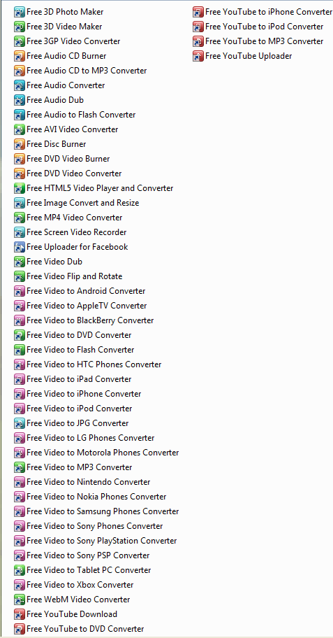
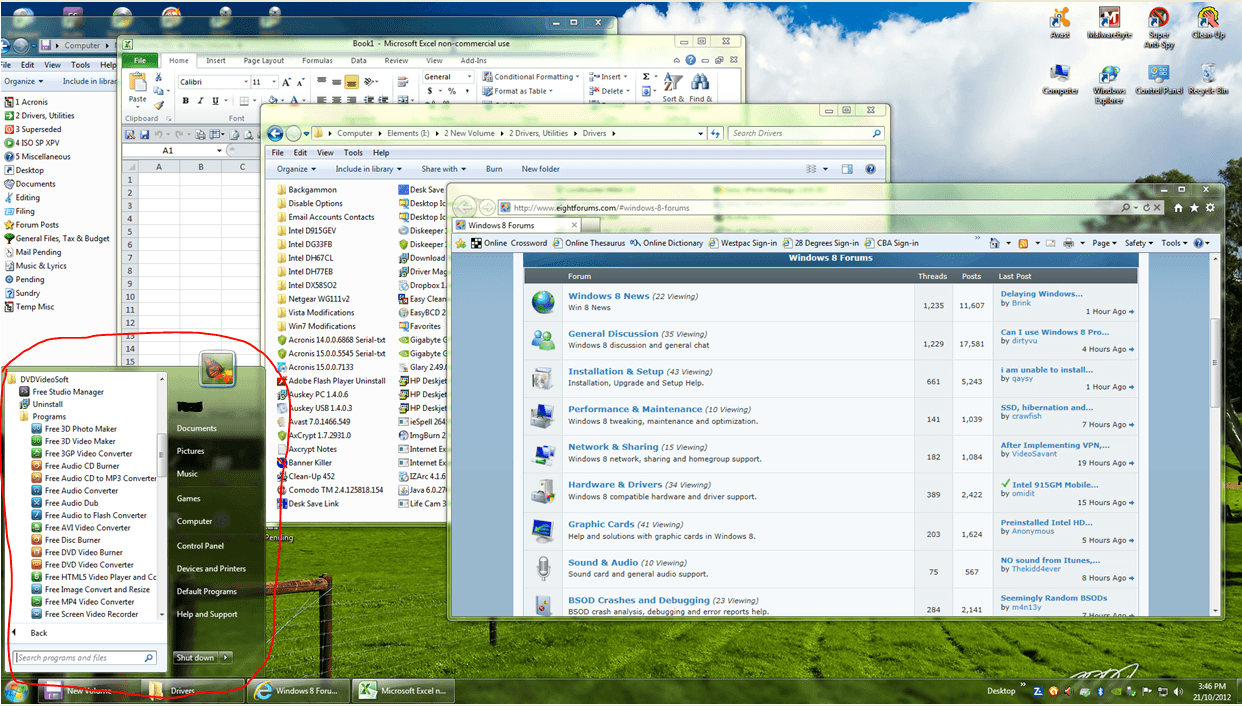
This is an example using: DVDVideoSoft Studio Manager which has 47 sub-menu items.​

I've got all 47 of these sub-menu items in Start Menu as icons, (equals to the tiles in Metro), in a condensed form that takes up a fraction of the space, and accessible without leaving desktop. Why would I want to leave the desktop to find them in Metro for the sake of a larger view, and more difficult to access?


1. Sub-Menu of Studio Manager .

1 Total Studio Manager sub menu.PNG


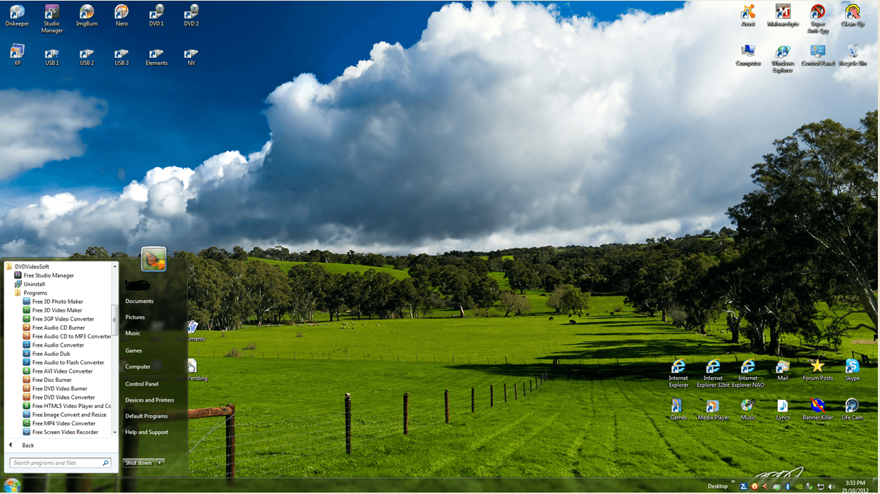
2. Desktop with Studio Manager sub-menu open in Start Menu.

Start Menu occupies approx 12% of desktop.

2. Start Menu on desktop.PNG


3. Desk top with multiple windodws & Start Menu open.

3. Multiple windows & Start Menu.PNG


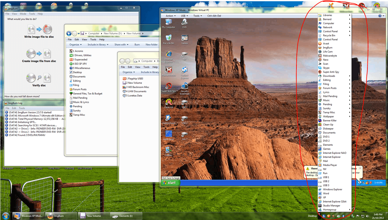
4. If multiple winodows obscure desktop shortcuts, Desktop toolbar shows all shortcuts.

4. Multiple windows & Desktop toolbar.PNG

Everything can be done without ever having to leave the desktop or lose view of any files/folders ...

And in the minimum space and quickest access
.

Desktop simultaneously shows access to
:

  • Start Menu
  • Jump list
  • Desktop icons (via Desktop toolbar if needed)
  • Multiple open windows (including iNet browser, XP Virtual, Spreadsheet)

ALL IN ONE NEAT PACKAGE!
 
Last edited:

My Computer

System One

  • OS
    Windows 7 Ult Reatil & Win 8 Pro OEM
    System Manufacturer/Model
    Built as DIY
    CPU
    6 core 12 thread & 4 core
    Motherboard
    Inel Extreme & Intel standard
    Memory
    12GB & 8GB
    Graphics Card(s)
    3 top end SLI linked & onboard
    Sound Card
    In built in graphics card & onboard
    Monitor(s) Displays
    24 & 23 inch Samsung LED backlit
    Screen Resolution
    High def
    Hard Drives
    Corsair Force 128GB SATA3 SSDs in each machine. Plus several external USB3 and eSATA spinner HDs
Anyone else looked at this one:
https://www.pokki.com/

A bit of a new approach to the start menu. There is not a lot of customisation opportunities, but it does offer a couple of differences
 

My Computer

System One

  • OS
    Windows 8.1
    Computer type
    PC/Desktop
    Other Info
    Use several different computers during a day, so specs are irrelevant.
^ But when i started playing with Windows 8, they didn't have that little video, I didn't really know much about the Charms bar and I didn't find the power off option from the Charms pc settings. I actually found it by logging out from the Start Screen, and then hitting the power button on the logon screen in the lower corner. These hidden menus are not terribly intuitive and having to use hot corners isn't all that appealing for all of us.

And I don't care if Coke Robot thinks it's wicked awesome to flip over to a full screen view of his start tiles to pick an application. All of the delight in the world on his part, doesn't mean I want to experience the same thing. I'm not saying the Start Screen is unusable, but I'm saying that I don't really want to use it.

Without a doubt, here in the US where I live, the majority of cars are automatics. People love to drive them and they are easy to use. But one of my cars happens to be a manual and I absolutely love it. I also happen to own a station wagon too, even though they aren't terribly popular. And I don't torrent movies and tv shows. ---My point being, we are all different and we work different and we have different inclinations.

sorry for the late response, BUT liking to drive a care with manual gear is nice if your automatic car has only 3-4 speeds.

I live in Europe and ONLY drive automatic and will never ever change this again.

Do not see the point or advantage of driving manual at all.

But this is about Win8 and I totally agree with Coke Robot. And above this he who says that there is no difference with Win7......PLEASE.......

Jeff
 

My Computer

System One

  • OS
    WINDOWS 8.1 x64
    Computer type
    PC/Desktop
    CPU
    INTEL CORE I--3770K LGA1155
    Motherboard
    ASUS P8Z77-V
    Memory
    KINGSTON 2400 MHZ KHX24C11K4 16GB
    Graphics Card(s)
    INTEL HD GRAFICS 4000
    Monitor(s) Displays
    Philip BDL3245€ 32 inch
    Screen Resolution
    1920 x 1080
    Hard Drives
    2 SAMSUNG 840 PRO RAID 0 ON BOARD 2 x 128 GB
    Keyboard
    LOGITEC MX™ 5500
    Mouse
    LOGITEC MX 5500
    Internet Speed
    120 Mbps
nice try - but how do you actually set this up

Hello Jimbo. This requires no set up at all. It is done automatically by the Operating System just as happens with the start menu. I said nothing about the Start Screen. The Start Screen is the same thing as a place for desktop icons. You can pin or unpin what you need or don't need from the Start Screen. Groups are automatically created, organized, sorted and labeled in all apps.

http://www.eightforums.com/general-discussion/9789-all-apps-new-start-menu.html?highlight

From the Start Screen - right click and press enter
Program Groups in all apps are reduced to blocks using the zoom feature.

bottom right corner of screen in apps area

View attachment 9729

or press control and roll your scroll wheel


Hi there


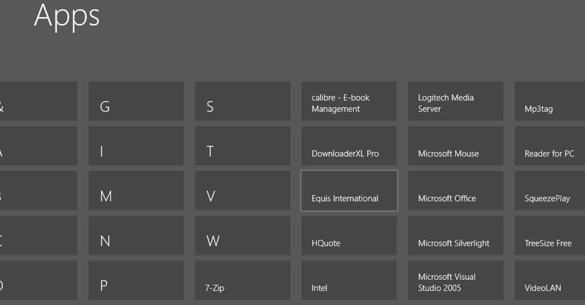
If I do this I just get a reduced view of ALL the tiles -- I don't want to see any but the top level one. screen shot enc.

This is even WORSE and more confusing than the original layout.

I just want to see the TOP level block for example "Most Used" and then have the option expand THAT BLOCK ONLY.

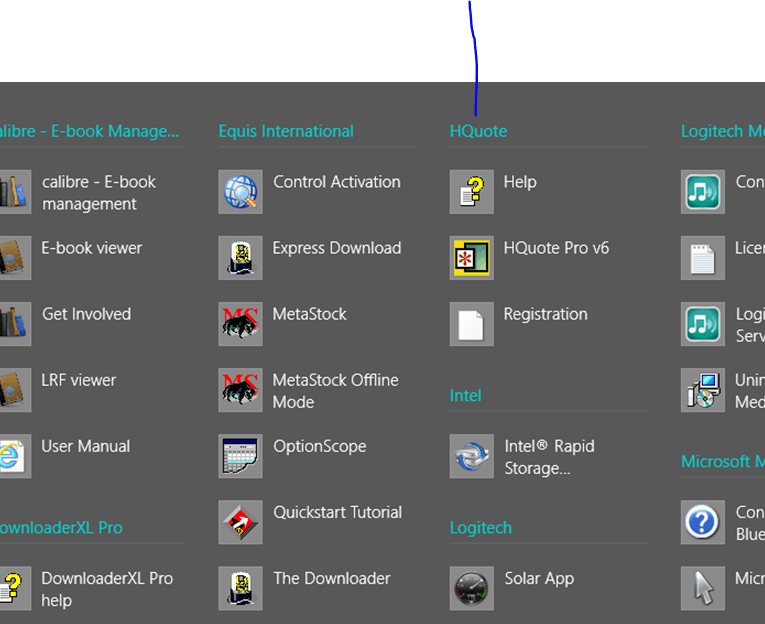
If I finally get into the Apps area then It will show me a top level tile with an APP in it for example here I have a stock exchange application called HQUOTE -- just a simple application without many sub options.

but if I click on this then I get a screen full of other stuff as well -- not what I want.

I've enclosed the screenshots.

Some of this can be managed on simple screens but IMO this is still a total "Dogs Dinner" of how to properly organise your workspaces for a lot of people where the standard tile functionality isn't really fit for purpose and there's nothing "Dynosaural" or change resisting emotions here. W7 menu is really in a lot of cases MUCH EASIER, quicker and convenient to work with than this half baked Mobile phone system.


(Using W8 enterprise X-64).

Cheers
jimbo
 

Attachments

  • desktop.png
    desktop.png
    31.8 KB · Views: 173
  • dk1.png
    dk1.png
    30.7 KB · Views: 160
  • dk2.png
    dk2.png
    51.2 KB · Views: 173
Last edited:

My Computer

System One

  • OS
    Linux Centos 7, W8.1, W7, W2K3 Server W10
    Computer type
    PC/Desktop
    Monitor(s) Displays
    1 X LG 40 inch TV
    Hard Drives
    SSD's * 3 (Samsung 840 series) 250 GB
    2 X 3 TB sata
    5 X 1 TB sata
    Internet Speed
    0.12 GB/s (120Mb/s)
Hello Jimbo. I don't work for Microsoft. Just showing what they have. Basically, I think they have removed nesting to make it easier for touch. You could say touch has no place on a traditional pc, and that is a fair statement. But that is not the OS model. 8 is a schizophrenic hybrid phone desktop OS. What else can I say. Thanks
 

My Computer

System One

  • OS
    Server 2012 / 8.0
    Computer type
    PC/Desktop
    System Manufacturer/Model
    Home Built
    CPU
    Intel i7 QuadCore 3770k
    Motherboard
    Asrock Extreme 4
    Memory
    16GB Crucial Ballistix
    Graphics Card(s)
    intel embedded gpu
    Sound Card
    Sound Blaster Z
    Monitor(s) Displays
    AOC / Westinghouse
    Screen Resolution
    1920x1080
    Hard Drives
    Plextor pcie msata
    PSU
    Rosewill Silent Night 500W Fanless / PicoPSU
    Case
    open bench - no case enclosure
    Cooling
    Silverstone HEO2 Passive Silent
    Keyboard
    logitech washable K310
    Mouse
    logitech wired
    Browser
    ie / maxthon
    Other Info
    Totally silent. No fans at all.
ALL IN ONE NEAT PACKAGE!

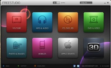
Hello Mustang. DVDVideosoft is a very nice program. Just downloaded it. The latest version has it's own UI and menu system...only requires 1 tile on the start screen.

fs.jpg

fs1.jpg

Quite a post! Well done.
 

My Computer

System One

  • OS
    Server 2012 / 8.0
    Computer type
    PC/Desktop
    System Manufacturer/Model
    Home Built
    CPU
    Intel i7 QuadCore 3770k
    Motherboard
    Asrock Extreme 4
    Memory
    16GB Crucial Ballistix
    Graphics Card(s)
    intel embedded gpu
    Sound Card
    Sound Blaster Z
    Monitor(s) Displays
    AOC / Westinghouse
    Screen Resolution
    1920x1080
    Hard Drives
    Plextor pcie msata
    PSU
    Rosewill Silent Night 500W Fanless / PicoPSU
    Case
    open bench - no case enclosure
    Cooling
    Silverstone HEO2 Passive Silent
    Keyboard
    logitech washable K310
    Mouse
    logitech wired
    Browser
    ie / maxthon
    Other Info
    Totally silent. No fans at all.
mdmd said:
Quite a post! Well done.
Thank you mdmd. That's just the set-up that suits me.

Yes, DVDVideosoft Studio is a great program and totally free. It really does it all. I normally open it with a desktop shortcut, (top left in pic of my desktop), but used it as an example of a multi-sub-menu app.

Using the Ex7ForW8 hack restores the traditional Orb start menu, and also totally swtiches off Metro. During installation it requres the W7 installation disc from which it extracts files to set up Explorer 7. So you've virtually got W7 in W8 OS, with W8 improvements.

However, the beauty of Ex7ForW8 is that it leaves Metro intact and it can be accessed with a single click of the toggle switch if you need to go there for apps or any other reason.

Cheers M :D
 
Last edited:

My Computer

System One

  • OS
    Windows 7 Ult Reatil & Win 8 Pro OEM
    System Manufacturer/Model
    Built as DIY
    CPU
    6 core 12 thread & 4 core
    Motherboard
    Inel Extreme & Intel standard
    Memory
    12GB & 8GB
    Graphics Card(s)
    3 top end SLI linked & onboard
    Sound Card
    In built in graphics card & onboard
    Monitor(s) Displays
    24 & 23 inch Samsung LED backlit
    Screen Resolution
    High def
    Hard Drives
    Corsair Force 128GB SATA3 SSDs in each machine. Plus several external USB3 and eSATA spinner HDs
Hello Jimbo. I don't work for Microsoft. Just showing what they have. Basically, I think they have removed nesting to make it easier for touch. You could say touch has no place on a traditional pc, and that is a fair statement. But that is not the OS model. 8 is a schizophrenic hybrid phone desktop OS. What else can I say. Thanks

Hi there mdmd
Thanks for the reply

You can see now where the difficulty is for some people.

80% of people don't seem to understand the problem --which conversely might be good for W8 since if my type of problems are relatively rare then W8 will actually be a winner for Ms.

However the developers at Redmond should understand that there are problems with the new UI -- and it's really not due to people wanting to "revert to the past".

Cheers
jimbo
 

My Computer

System One

  • OS
    Linux Centos 7, W8.1, W7, W2K3 Server W10
    Computer type
    PC/Desktop
    Monitor(s) Displays
    1 X LG 40 inch TV
    Hard Drives
    SSD's * 3 (Samsung 840 series) 250 GB
    2 X 3 TB sata
    5 X 1 TB sata
    Internet Speed
    0.12 GB/s (120Mb/s)
I agree I think that is where a lot of the argument stems from. People just assume all people want to go back to the past, just because they don't like the user interface. At least that's how I see it. People calling this modern. Yes it's new but functionality is important here. The user-interface needs work. I mean just focusing on function yes there are new things they added such as the ribbon which to me wasn't necessary and is cluttering the windows even more than it already is. But the hidden menu and hot spots are awkward. I'm wondering if the hidden menu is awkward for touch users. I get the hot spots are easy since you just swipe. But anyway for desktop users they haven't created a suitable replacement. Even some other menu would have been good. The start screen isn't bad but when you want to get to things that are simple and there is no easy way on the desktop such as a regular menu similar to the old one it just makes things uneasy. For touch users the start screen makes things easy not for portrait mode it seems but at least it works good for those that need a touch base windows computer. For desktop users things just don't work that great. Even in mac now it's similar. With all icons on the bottom but they still have a menu for settings and other general computer things that are visible to the user. I think the show desktop button on the taskbar now just looks like added space on the bar.
 

My Computer

Lets sum up this thread, :)

tseven
I agree I think that is where a lot of the argument stems from. People just assume all people want to go back to the past, just because they don't like the user interface. At least that's how I see it. People calling this modern. Yes it's new but functionality is important here. The user-interface needs work. I mean just focusing on function yes there are new things they added such as the ribbon which to me wasn't necessary and is cluttering the windows even more than it already is. But the hidden menu and hot spots are awkward. I'm wondering if the hidden menu is awkward for touch users. I get the hot spots are easy since you just swipe. But anyway for desktop users they haven't created a suitable replacement. Even some other menu would have been good. The start screen isn't bad but when you want to get to things that are simple and there is no easy way on the desktop such as a regular menu similar to the old one it just makes things uneasy. For touch users the start screen makes things easy not for portrait mode it seems but at least it works good for those that need a touch base windows computer. For desktop users things just don't work that great. Even in mac now it's similar. With all icons on the bottom but they still have a menu for settings and other general computer things that are visible to the user. I think the show desktop button on the taskbar now just looks like added space on the bar.


mdmd

It is my belief that Microsoft is respecting the intelligence of people enough to expect them to think that it would not be difficult to use. This video, in the article, is so lame and unfair. It's like, on the street, are you smarter than a 5th grader? questions. They are confronted with Windows 8 for the first time and are expected to review a 100 million dollar collaboration in 60 seconds. The interviewer is just as uninformed and biased as his father was. People, when confronted on the street, are usually confused and nervous especially when they are being videotaped. What would an on street interview of how people would respond to Ubuntu be like. People generally have to attend some kind of class or support group to learn how to use an Apple. If the interviewer is implying that Windows 8 is bogus because there is no start menu, or they can't see the desktop from the start screen, or they can't figure out how to shut down the computer, then the interviewer is deliberately trying to make a fool out of everyone he tasks.

Kat

If you can't do in 8 exactly what you did in Vista or 7, maybe you shouldn't HAVE a computer....

Yes, it's different.

But un-useable?

No way!

I loathed it at first, the DP was absolute crap.

But I put a bit of time into learning it and tweaking it to my preferences.

Now, I love it. The RTM is Rock-solid.

Windows 7 with a turbo, basically.

And you CAN ignore Metro if you use Classic Start or similar.

I'm keeping 7 (Ultimate 32-bit) on the desktop, but Win 8 RTM is here to stay on the Super-Lappy.

And the old lappy just LOVES the 32-bit Win 8 CP.....refuses to run the RP, but will run the 64-bit RTM with ease...go figure.


These are just a few I can agree with. ;)
Lots of others, and this thread is making a great point, everyone will move on. It is Microsoft's idea of the future, and we don't need to agree, thats why we have linux.

I think MS is heading the right way, and it is all your opinion! :)
 

My Computer

System One

  • OS
    Windows 8.1 Pro, iOS 7.1, Elementary OS
    Computer type
    Tablet
    System Manufacturer/Model
    Apple
    Memory
    1 GB
    Screen Resolution
    2048x1536
    Other Info
    iPad Air
Lets sum up this thread, :)

tseven
I agree I think that is where a lot of the argument stems from. People just assume all people want to go back to the past, just because they don't like the user interface. At least that's how I see it. People calling this modern. Yes it's new but functionality is important here. The user-interface needs work. I mean just focusing on function yes there are new things they added such as the ribbon which to me wasn't necessary and is cluttering the windows even more than it already is. But the hidden menu and hot spots are awkward. I'm wondering if the hidden menu is awkward for touch users. I get the hot spots are easy since you just swipe. But anyway for desktop users they haven't created a suitable replacement. Even some other menu would have been good. The start screen isn't bad but when you want to get to things that are simple and there is no easy way on the desktop such as a regular menu similar to the old one it just makes things uneasy. For touch users the start screen makes things easy not for portrait mode it seems but at least it works good for those that need a touch base windows computer. For desktop users things just don't work that great. Even in mac now it's similar. With all icons on the bottom but they still have a menu for settings and other general computer things that are visible to the user. I think the show desktop button on the taskbar now just looks like added space on the bar.


mdmd

It is my belief that Microsoft is respecting the intelligence of people enough to expect them to think that it would not be difficult to use. This video, in the article, is so lame and unfair. It's like, on the street, are you smarter than a 5th grader? questions. They are confronted with Windows 8 for the first time and are expected to review a 100 million dollar collaboration in 60 seconds. The interviewer is just as uninformed and biased as his father was. People, when confronted on the street, are usually confused and nervous especially when they are being videotaped. What would an on street interview of how people would respond to Ubuntu be like. People generally have to attend some kind of class or support group to learn how to use an Apple. If the interviewer is implying that Windows 8 is bogus because there is no start menu, or they can't see the desktop from the start screen, or they can't figure out how to shut down the computer, then the interviewer is deliberately trying to make a fool out of everyone he tasks.

Kat

If you can't do in 8 exactly what you did in Vista or 7, maybe you shouldn't HAVE a computer....

Yes, it's different.

But un-useable?

No way!

I loathed it at first, the DP was absolute crap.

But I put a bit of time into learning it and tweaking it to my preferences.

Now, I love it. The RTM is Rock-solid.

Windows 7 with a turbo, basically.

And you CAN ignore Metro if you use Classic Start or similar.

I'm keeping 7 (Ultimate 32-bit) on the desktop, but Win 8 RTM is here to stay on the Super-Lappy.

And the old lappy just LOVES the 32-bit Win 8 CP.....refuses to run the RP, but will run the 64-bit RTM with ease...go figure.


These are just a few I can agree with. ;)
Lots of others, and this thread is making a great point, everyone will move on. It is Microsoft's idea of the future, and we don't need to agree, thats why we have linux.

I think MS is heading the right way, and it is all your opinion! :)

Hi there
moving on is fine -- but if it makes what you do more awkward / complicated without any tangible benefits -- then something's gone horribly wrong.

One good thing Ms had over "The Fruit Company" was that windows could run almost any conceivable piece of hardware and software thrown at it.

However some of this software is complex and can't be reduced to a One dimensional set of tiles.

Without some way of having either a hierarchical system or a two dimensional expanding tile display this interface isn't going to please a lot of users.

Cheers
jimbo
 

My Computer

System One

  • OS
    Linux Centos 7, W8.1, W7, W2K3 Server W10
    Computer type
    PC/Desktop
    Monitor(s) Displays
    1 X LG 40 inch TV
    Hard Drives
    SSD's * 3 (Samsung 840 series) 250 GB
    2 X 3 TB sata
    5 X 1 TB sata
    Internet Speed
    0.12 GB/s (120Mb/s)
Hi there
It's so easy for people to say just pin the applications you want to the task bar or send to desktop in the desktop view (as in previous versions of windows) but what some of these people fail to understsnd that for some people this isn't the solution either -- especially if you have some complex applications with a lot of HIERARCHIAL / SUB menus and SUB SUB menus etc. - If you were to try and put all these on the taskbar you are "merely re-creating" the tiles that you'd see on the start screen and you aren't any better off.

It's the lack of a HIERARCHIAL structure that is the problem.

For instance I don't mind the Tiles per se but say I install ADOBE CS -- now instead of installing 10 zillion tiles for this app why can't it work as ONE TILE which if I clicked on the tile would EXPAND into a VERTICAL set of tiles so I could then select my desired sub application.

I have Adobe CS5. I don't see what the problem is. It is arranged in a hierarchical fashion in the all apps view and the regular view. But for the key components for me (Photoshop, Premiere, and Illustrator), I moved copies (though copies isn't the right word) to the front of the start screen as I use them as much as I web browse.
 

My Computer

System One

  • OS
    Windows 8.1 Pro
I went to Staples, saw new laptops with Win 8 on them, tried to find Control Panel and Device Manager to see what video card it had. Yeah, I never found that info in 5 minutes. The Charm Bar was impossible to use with the touchpad mouse. Didn't see CP anywhere.

I thought I saw a YouTube video that showed how to get the Start Menu into Win 8, but another YouTube video stated that M$ disabled the ability of 3rd party programs to enable a Start Menu since.

My parents are definitely not going to be using Win 8. Now I have to decide whether my dad is going to die of old age before Win XP expires in April 2014, he still uses DOS 6.22!
 

My Computer

System One

  • OS
    Windows 7 Home Premium, Win 8 Pro DVD
    System Manufacturer/Model
    HP m7-1015dx Laptop
    CPU
    2.3 Ghz - 3.3 Ghz
    Memory
    8 GB
    Graphics Card(s)
    Radeon HD 4000
    Monitor(s) Displays
    LCD
    Screen Resolution
    1600 x 900
    Hard Drives
    1 TB 5400 RPM
    Keyboard
    External USB
    Mouse
    Optical Mouse
    Internet Speed
    15 mbps dl / 1 Mbps ul
    Antivirus
    Avast!
Hi Cymbal Man Freq. Welcome to EightForums.

Pointer lower left corner -> Mini Start Screen appears -> right click -> guts menu appears with CP on it.
 

My Computer

System One

  • OS
    8.1 Pro X64
    Computer type
    PC/Desktop
    System Manufacturer/Model
    Acer T690
    CPU
    Intel Pentium D Dual Core
    Motherboard
    Acer/Intel E946GZ
    Memory
    2GB (max upgrade)
    Graphics Card(s)
    Intel Graphics Media Accelerator 3000 - PCI Express x16
    Sound Card
    Integrated RealTek ALC888 high-definition audio with 7.1 channel audio support
    Monitor(s) Displays
    Acer AL1917W A LCD
    Screen Resolution
    1440 X 900
    Hard Drives
    350 GB Seagate Barracuda 7200.10
    Thumb drives
    PSU
    Standard 250 watt
    Case
    Desktop 7.2" (183mm) W x 17.5" (445mm) L x 14.5"
    Cooling
    Dual case fans + CPU fan
    Keyboard
    Acer Windows PS/2
    Mouse
    Wireless Microsoft Arc
    Internet Speed
    54mbp/s
    Browser
    IE11
    Antivirus
    Defender
    Other Info
    Office Pro 2013 / Nokia Lumia 1520 Windows Phone 8.1DP GDR1
I still want a Start button and perhaps a close button for those dreaded Metro apps that won't run on my netbook because of low resolution so I hooked it up to a bigger monitor and it crashes on the RP.
 

My Computer

System One

  • OS
    Windows 7 Ultimate, Windows Developer Preview, Linux Mint 9
    System Manufacturer/Model
    Custom Built
I went to Staples, saw new laptops with Win 8 on them, tried to find Control Panel and Device Manager to see what video card it had. Yeah, I never found that info in 5 minutes. The Charm Bar was impossible to use with the touchpad mouse. Didn't see CP anywhere.

I thought I saw a YouTube video that showed how to get the Start Menu into Win 8, but another YouTube video stated that M$ disabled the ability of 3rd party programs to enable a Start Menu since.

My parents are definitely not going to be using Win 8. Now I have to decide whether my dad is going to die of old age before Win XP expires in April 2014, he still uses DOS 6.22!

Press the Windows key and the Pause/break key to bring up the System screen. That screen lists the WEI and links to a more detailed score which will give you a rough indication of how fast that PC is. A link to Device manager is also listed on the upper left on the System Screen.
 

My Computer

System One

  • OS
    Windows 10 Education 64 Bit
    Computer type
    PC/Desktop
    System Manufacturer/Model
    Asus
    CPU
    AMD Phenom II X4 980 Black Edition Deneb 3.7GHz
    Motherboard
    ASUS M4N68T-M V2 µATX Motherboard
    Memory
    8GB 4GBx2 Kingston PC10600 DDR3 1333 Memory
    Graphics Card(s)
    NVIDIA Geforce GT640 2 Gig DDR3 PCIe
    Sound Card
    VIA VT1708s High Definition Audio 8-channel Onboard
    Monitor(s) Displays
    22" LG E2242 1080p and 2 19" I-INC AG191D
    Screen Resolution
    1280x1024 - 1920x1080 - 1280x1024
    Hard Drives
    Crucial MX100 256 GB SSD and 500 GB WD Blue SATA
    PSU
    Thermaltake TR 620
    Case
    Power Up Black ATX Mid-Tower Case
    Cooling
    Stock heatsink fan
    Keyboard
    Logitech Wireless K350 Wave
    Mouse
    Logitech M570 Trackball and T650 TouchPad
    Internet Speed
    80 Mbps Down 30 Mbps Up
    Browser
    Internet Explorer 11
    Antivirus
    Windows Defender
    Other Info
    HP DVD1040e Lightscribe - External USB2
Back
Top