Sometimes less is more (when expressing yourself).
My Computer
System One
-
- OS
- Windows Phone 6, Windows CE 5, Windows Vista x32, Windows 7 x32/x64, Windows 8 x64

Sometimes less is more (when expressing yourself).


") .
.Windows 8 requires me to go to the desktop every time that I want to open a new program, with Windows 7, I just click on a taskbar icon, or the start button and select a program. This is much more efficient than going to another page to reveal the Windows 8 start menu and look for what I need.
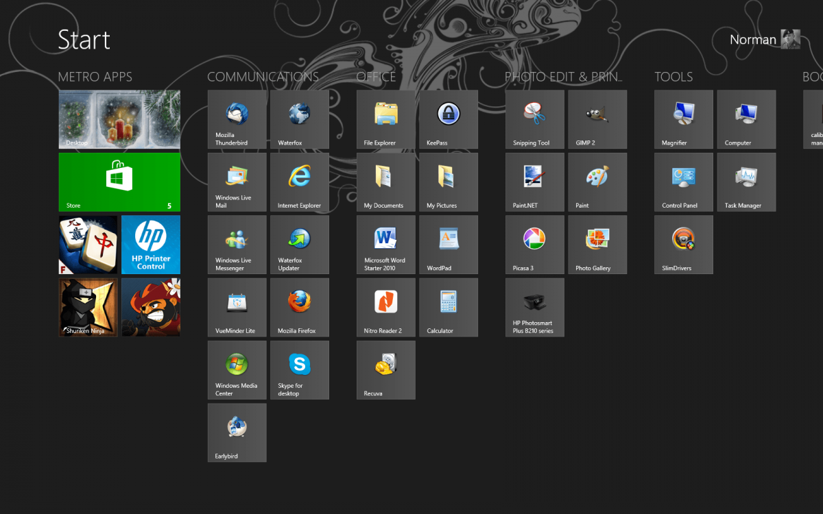
The Windows 8 menu is perfect for mobile phones, as you are restricted by the screen size, so you need to maximise the visual cues for what you're looking for, and the touch experience is ideal, as you can sweep across the screen for groups of icons. This process gives you 'chunks' of information that is easy to digest on a small screen, but becomes cluttered and tedious on a large screen where you see everything at once.
When is Microsoft going to introduce a dual, triple etc screen mobile phone, so that we can use the Modern apps across multiple screens?
It is not where it used to be in Windows 7. The start menu is missing, Period, unless you elect to install 3rd party apps. When I mentioned that my friend gave a big sigh of relief after I loaded up classic shell on his new laptop, I was not lying. He does a lot of designing in illustrator etc, and he found getting around in windows 8 to be a pain in the ass. Everyone of my friends and colleagues have expressed the same, which was my point in posting. I remotely support hospital servers from home all across the US and typically have anywhere from 15-30 windows open at a given time.. sometimes more. I don't imagine as a company we will be transitioning to 8 any time soon. Sometimes, you just want to click the start menu, and hit a quick link from the same location it has lived for 15 years, because it is familiar and easy. You don't have that CHOICE in windows 8, unless you want to install 3rd party apps.
So for those who say, "You do have a CHOICE, you can just hit the desktop button and walla," you are missing the point. You know you are missing the point, but you insist on sticking to your guns.
Everyone who has replied has failed to answer my question.. What is wrong with Choice? What is wrong with giving users the option of doing things the way they always have from a desktop, while at the same time giving them the option of trying something new?
I get that there are many around these boards who love the new look and the new way of doing things. Can you not at least admit though, that it was wrong to take away other peoples choice?
I did see someone reply to a similar put question around here... "Well, if they gave people choice, no one would use it and it would defeat the purpose." I found that remark to be very telling
i think what your forgeting is the purpose behind the start screen.
it's not meant to be a direct replacment of the old start menu, but an evolution of it instead where live tiles are the norm and you can view instantly what is happening in any given app.
if you can utilise the start screen and the apps to get that live info to it's fullest then it is more efficent, it's just not that easy to do sometimes, takes a bit of lateral thinking outside of the box.
I don't care about live tiles. In my earliest post within this thread, I made the statement that I had yet to glean any information from live tiles that justifies using them instead of nice clear icons that make it easy to know what program I am opening. I stand by it. I like the concept of a windows store built into the OS. Live tiles might be useful I guess, for someone who just wanted to stare at their start screen, waiting for and interesting live tile update. That ain't me. I think they tried to be innovative, but I don't see any other companies copying this any time soon. Android widgets are way better, many of them offering the ability to control the app strait from the icon widget. Now, something like that might be useful.
Anyhow.. time will tell if someone takes a crack at answering my question.. Why did they not give people a choice?


Win 8 HAS laid an egg like the aggressive Chicken that it is! It's no wonder that Windows Blue has been mentioned as a successor in the Summer. This OS is too progressive for the consumer public and that's it in a nutshell. Back to Windows 7 Ultimate, solid contender that it is. Tremendously stable, right on time.

Interesting points?
- A user name was not required until Win 7 – which gave you the option of using the same name as the computer – Win 8 insists on a different user name which shows up in uploads and NOT the computer name. Since I have a stand-alone computer and I know what my name is, why does Microsoft insist I have a user name at all?
- Yes, Experience programs are options – exactly where in the instruction manual does it point out where all these MANY hidden options are?
- Exactly where in the instruction manual can you find the hidden GPS locater options? More to the point – why does Microsoft want to know your location?
- If I’m not mistaken, didn’t Microsoft advertise the new Internet Explorer can be used without 3[SUP]rd[/SUP] party add-ons?
- Where in the instruction manual does it say that their new Windows pdf reader is BASIC?
- Classic Shell can resize windows so I can have ‘more than two’ windows on the screen at the same time.
- I believe Microsoft advertising for Windows 8 is border-line consumer fraud.
- Oh, and exactly where is the instruction manual?
- So, I’m not wrong. I don’t misunderstand and very little on Windows 8 is the same as it’s always been. What the heck are YOU talking about!