How Much Change is Too Much Change?

With Windows 8 Microsoft are moving the goalposts in user interface design considerably and there has been much debate over the relative pros and cons of taking this approach. With Windows 8 though if you don’t like the new Metro touch UI then you’re out of luck switching to the ‘traditional’ desktop as well. Here the ribbon is being implemented in Windows Explorer and is being pushed throughout the operating system.

The ribbon, first introduced in Office 2007, has split opinion and many people still dislike it if they are forced to use it or not. In fact the ribbon has been around for so long now that a great number of people who are now using it at home or at work, have decided firmly that they can’t find things, they don’t like it and that it’s not for them. This isn’t a snap judgement on the parts of these people, this is their considered view after a great deal of use.

How Much Change is Too Much Change?
 
Basically since Win 95 the GUI has been the same. Yes. there is quite a difference in the look and feel, however, there is really little difference in the long run. We all know that sooner or later the GUI was/is going to move into another direction, and that may be what MS is doing with Win 8. At the present it would appear that you will still be able to revert to the old style GUI (Win 7) if that is what you prefer.

Myself, I am looking forward to something new. It will be a challenge to see what I can do with it. Also as we all know within a year of its release (or less) someone will have figured out a way to skin the OS to bring about a look and feel that some would rather use then native GUI.
 
Last edited:
When the beta is released, I'll install it and see how things look.
Learning something new is always fun, even if you don't like what you are learning...;)
 
I think that the change with the UI is for the best. We are at the point where we are being held back by the old UI. In 2 years people will be praising the change because of how it will improve user proformace.
 
I think the ribbon is great. It makes you feel at home across a variety of different programs.

As far as the Metro goes, I reserve my judgement until I see the final product. What I have seen up to now does not seem to be of great advantage on e.g. a desktop.
 
Hi there
The main problem at the moment is not with the Metro UI itself but the fact that there doesn't seem to be an easy way of organising the apps decently.

For instance if you install a program for example Nero -- then all its sub obtions or menu sub levels are installed in their own metro tiles. This has two consequences -- you have to scroll a lot LEFTWARDS with the mouse -- OK no big deal but then you also have find the specifc function you want.

You can of course create standard desktop short cuts but that goes against the design philosophy of the new GUI.

For example

Application 1===>suboption 1
suboption 2
suboption 3====>lower option1
lower option 2===>next_level_down1

and so on.

all these are currently displayed in their own tiles on the metro desktop.

I'd prefer the Main tile say for Application 1. After clicking / tapping the main tile a a small window containing tiles for the sub options and so on would pop up.


Cheers
jimbo
 
The main problem at the moment is not with the Metro UI itself but the fact that there doesn't seem to be an easy way of organising the apps decently.

Yeah, every .exe gets a tile. Even the uninstallers of programs.

I also think that the main problem of Metro is the organization of tiles... but i have to admit that after almost 2 months using it i'm getting used to it.

Another point is that based on the feedback that MS is receiving, we may expect some considerable changes in the public beta.
 
I doesn't pay to try and ram things down people's throat....especially if you want them to pay for it:)
 
MS has yet to see that happen, Ivan, and I doubt the direction MS is taking with Win8 will create such outrage as the examples you cite.

Remember, we are looking at a Developer Preview, not even a pre-beta or a beta.

I like it, so far. I look forward to dumping my iPhone and having a similar UI experience across devices. I think MS is headed in the right direction, personally.

I am a bit dismayed, however, at the reduction in customization from the DP to the pre-beta as reported here:

WinUnleaked.tk » How to use a custom background for metro start menu in Windows 8 Pre-BETA

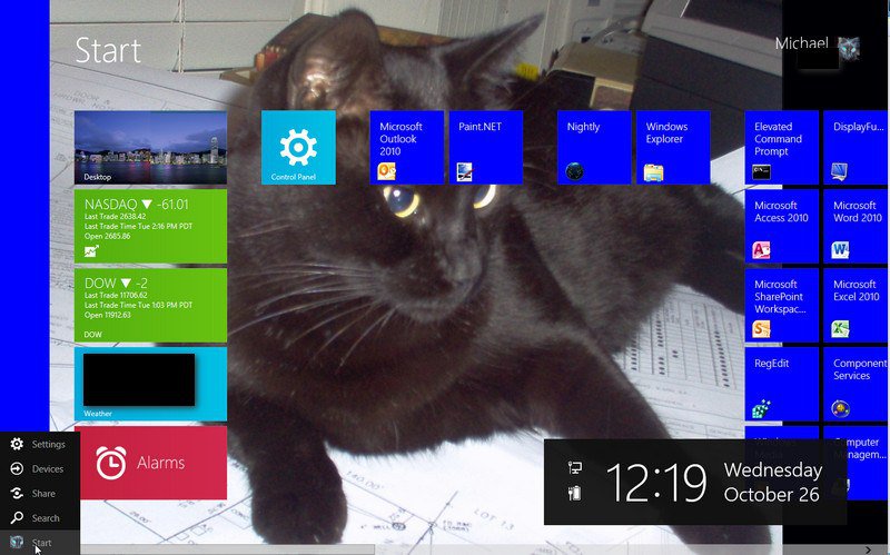
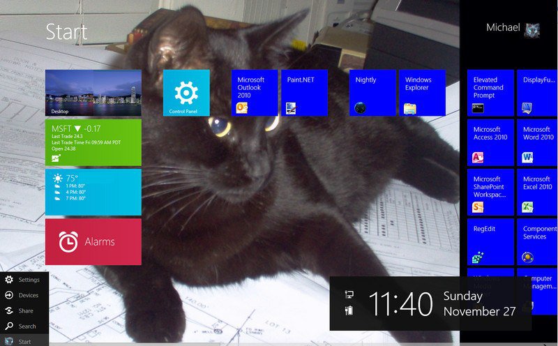
With the DP, and a little help, I was able to do this:

2011-10-26_002000.jpg
 
Last edited:
I still think they should release the same windows but ask the user if they want Metro or the default Win7-like UI OR stick Metro for the mobile devices and Win7-like UI for laptops & desktops. Metro just doesn't look good in file management. And, with the number of software I have installed, it will be tile-hell for me. :\

EDIT
mikedl, you date says October 26 (now 27). We are in November dude. xD
 
Back
Top