Five reasons why the Windows desktop isn't going away

At least Ed Bott is optimistic for the desktop, Ed Bott is a well respected journalist and he seems to be optimistic that the desktop is not going to disappear. That, at least, is comforting.


The speculation on the next version of Windows (code-named Blue) is getting out of hand. Based on a few screenshots and one offhand remark from a prominent Windows blogger, one of my colleagues is convinced that the Windows desktop is an endangered species. Nope. Not gonna happen.

Read more at source:
Five reasons why the Windows desktop isn't going away | ZDNet
 
Last edited by a moderator:
Right, I am on Mint Mate too (after several years with Ubuntu). One has to get prepared for the future. Windows is out, Mint is in.
 

My Computer

System One

  • OS
    Vista and Win7
    System Manufacturer/Model
    2xHP, 2xGateway, 1xDell, 1xSony
    Hard Drives
    5 SSDs and 12 HDs
Right, I am on Mint Mate too (after several years with Ubuntu). One has to get prepared for the future. Windows is out, Mint is in.
You are literally in the small niche minority.
 

My Computer

System One

  • OS
    Windows 8.1 Pro
    Computer type
    PC/Desktop
    System Manufacturer/Model
    ASUS
    CPU
    AMD FX 8320
    Motherboard
    Crosshair V Formula-Z
    Memory
    16 gig DDR3
    Graphics Card(s)
    ASUS R9 270
    Screen Resolution
    1440x900
    Hard Drives
    1 TB Seagate Barracuda (starting to hate Seagate)
    x2 3 TB Toshibas
    Windows 8.1 is installed on a SanDisk Ultra Plus 256 GB
    PSU
    OCZ 500 watt
    Case
    A current work in progres as I'll be building the physical case myself. It shall be fantastic.
    Cooling
    Arctic Cooler with 3 heatpipes
    Keyboard
    Logitech K750 wireless solar powered keyboard
    Mouse
    Microsoft Touch Mouse
    Browser
    Internet Explorer 11
    Antivirus
    Windows Defender, but I might go back on KIS 2014
Canonical has the same goal (unified GUI in all computer sectors) with Ubuntu Unity
The problem is that the Unity UI is not the yellow of the egg either. There are much nicer UIs in Linux land. But they are not as agressive with marketing them as Canonical.

Example: Home | Canonical

Agreed.

Even though Unity's better than Metro, I swapped to Linux Mint MATE, because I found Unity (and GNOME 3) to be horrible.

I agree with you Coke with the exception of some who absolutely refuse to see the improvement.

You can't see something that is invisible or non-existent.

What improvements does it bring to a desktop without a Touch input device?

Two Device Managers (one of which is basically useless)?
Two Control Panels (one of which is basically useless)?
A "Start Menu" that blocks the entire screen?
1. Hybrid Boot
2. Windows Defender built in
3. New Task Manager
4. Storage Spaces
5. Improve system resource management
6. Automatic Maintenance
7. Improved Action Center
8. Less dialog box pop ups to confirm if you want to delete a file
9. File Explorer Ribbon (for those that do a lot of file management, FAR superior than 7, no case or argument)
10. Improved dual monitor support
11. Much more improved device driver support and installation
12. Better file copy times and a new file copy/paste dialog box
13. Native USB 3.0 support
14. Most flexible UI that all the H8ers out there vehemently do not understand how to use, the Start Screen.
 

My Computer

System One

  • OS
    Windows 8.1 Pro
    Computer type
    PC/Desktop
    System Manufacturer/Model
    ASUS
    CPU
    AMD FX 8320
    Motherboard
    Crosshair V Formula-Z
    Memory
    16 gig DDR3
    Graphics Card(s)
    ASUS R9 270
    Screen Resolution
    1440x900
    Hard Drives
    1 TB Seagate Barracuda (starting to hate Seagate)
    x2 3 TB Toshibas
    Windows 8.1 is installed on a SanDisk Ultra Plus 256 GB
    PSU
    OCZ 500 watt
    Case
    A current work in progres as I'll be building the physical case myself. It shall be fantastic.
    Cooling
    Arctic Cooler with 3 heatpipes
    Keyboard
    Logitech K750 wireless solar powered keyboard
    Mouse
    Microsoft Touch Mouse
    Browser
    Internet Explorer 11
    Antivirus
    Windows Defender, but I might go back on KIS 2014
Most flexible UI that all the H8ers out there vehemently do not understand how to use, the Start Screen.

It is because they cannot understand.:sarc:
 

My Computer

System One

  • OS
    7/8/ubuntu/Linux Deepin
    Computer type
    PC/Desktop
1. Hybrid Boot
2. Windows Defender built in
3. New Task Manager
4. Storage Spaces
5. Improve system resource management
6. Automatic Maintenance
7. Improved Action Center
8. Less dialog box pop ups to confirm if you want to delete a file
9. File Explorer Ribbon (for those that do a lot of file management, FAR superior than 7, no case or argument)
10. Improved dual monitor support
11. Much more improved device driver support and installation
12. Better file copy times and a new file copy/paste dialog box
13. Native USB 3.0 support
14. Most flexible UI that all the H8ers out there vehemently do not understand how to use, the Start Screen

Nice list. I give you 3, 5 and 12. Would be nice to have that in /7. The rest I can care less. And #6 I have just disabled. Here is how:


1. write schedule on the Start menu
2. in the search options on the right click on Settings
3. click on Schedule Tasks on the left
4. double click on Task scheduler library (top left)
5. Then drill down Microsoft > Windows > Task Scheduler
5. on the right, right click on Regular Maintenance > Disable
6. Same for Idle Maintenance above
 

My Computer

System One

  • OS
    Vista and Win7
    System Manufacturer/Model
    2xHP, 2xGateway, 1xDell, 1xSony
    Hard Drives
    5 SSDs and 12 HDs
1. Hybrid Boot
2. Windows Defender built in
3. New Task Manager
4. Storage Spaces
5. Improve system resource management
6. Automatic Maintenance
7. Improved Action Center
8. Less dialog box pop ups to confirm if you want to delete a file
9. File Explorer Ribbon (for those that do a lot of file management, FAR superior than 7, no case or argument)
10. Improved dual monitor support
11. Much more improved device driver support and installation
12. Better file copy times and a new file copy/paste dialog box
13. Native USB 3.0 support
14. Most flexible UI that all the H8ers out there vehemently do not understand how to use, the Start Screen

Nice list. I give you 3, 5 and 12. Would be nice to have that in /7. The rest I can care less. And #6 I have just disabled. Here is how:


1. write schedule on the Start menu
2. in the search options on the right click on Settings
3. click on Schedule Tasks on the left
4. double click on Task scheduler library (top left)
5. Then drill down Microsoft > Windows > Task Scheduler
5. on the right, right click on Regular Maintenance > Disable
6. Same for Idle Maintenance above
Oh, and there is:
15. Better Automatic Repair
16. Improved UI for Advanced Repair
17. Less "nitty gritty" screens when updating Windows at restart and when disk check is running pre-boot mode
18. VASTLY improved hard drive checking, Windows automatically checks a new drive for errors and reports it to Action Center that actually notifies the user about that.
19. Windows 8 is eligible for more frequent updates, such as the new NT kernel 6.3 and better system resource management among other things.

I don't have Automatic Maintenance disabled, as I have it run daily. Keeps my PC running top notch.
 

My Computer

System One

  • OS
    Windows 8.1 Pro
    Computer type
    PC/Desktop
    System Manufacturer/Model
    ASUS
    CPU
    AMD FX 8320
    Motherboard
    Crosshair V Formula-Z
    Memory
    16 gig DDR3
    Graphics Card(s)
    ASUS R9 270
    Screen Resolution
    1440x900
    Hard Drives
    1 TB Seagate Barracuda (starting to hate Seagate)
    x2 3 TB Toshibas
    Windows 8.1 is installed on a SanDisk Ultra Plus 256 GB
    PSU
    OCZ 500 watt
    Case
    A current work in progres as I'll be building the physical case myself. It shall be fantastic.
    Cooling
    Arctic Cooler with 3 heatpipes
    Keyboard
    Logitech K750 wireless solar powered keyboard
    Mouse
    Microsoft Touch Mouse
    Browser
    Internet Explorer 11
    Antivirus
    Windows Defender, but I might go back on KIS 2014
I don't have Automatic Maintenance disabled, as I have it run daily. Keeps my PC running top notch
Especially as it defrags your SSD every day, LOL
 

My Computer

System One

  • OS
    Vista and Win7
    System Manufacturer/Model
    2xHP, 2xGateway, 1xDell, 1xSony
    Hard Drives
    5 SSDs and 12 HDs
I think the Desktop will disappear when most of the "four million desktop apps" used (seems like a high figure to me) are written in the Modern interface. I'm guestimating five years. It will remain a portal to the Modern UI until then.

I still cant see AutoCAD, ArcGIS and a dozen of scientific and math softwares that I use working productively in a Metro interface. I think that five years is a small time frame for that. Don't get me wrong. I like Metro, but there's much to be done in the next years to retire desktop.

Especially as it defrags your SSD every day, LOL

It's disabled here too. Defrag a SSD is pointless because of wear leveling techniques used in current SSDs. In the end of the day data will still be fragmented and you will have consumed precious write cicles.
 

My Computer

System One

  • OS
    Windows 10.0.10122
    Computer type
    PC/Desktop
    System Manufacturer/Model
    My Build - Vorttex Ultimate
    CPU
    Core i7 @ 4500 MHz
    Motherboard
    ASUS Z87-Plus
    Memory
    32GB DDR3 @ 1822 MHz (OC)
    Graphics Card(s)
    Radeon R9 280X 3GB @ 1180 / 6800 MHz
    Sound Card
    7.1 HDA
    Monitor(s) Displays
    LCD LG 22" + CRT LG 17"
    Screen Resolution
    1760 x 1320 / 1280 x 960
    Hard Drives
    1 x 240 GB SSD (System)
    3 x 500 GB HDD (Data/Media)
    1 x 2000 GB e-HDD (Backup)
    PSU
    ThermalTake 1000W PSU
    Case
    Corsair Carbide R300
    Cooling
    Corsair H60 (Push-Pull)
    Keyboard
    Microsoft Wireless Keyboard
    Mouse
    Microsoft Wireless Mouse
    Internet Speed
    60 Mbps (Down) 5 Mbps (Up)
    Browser
    IE, FF, Chrome
    Antivirus
    AVG Internet Security 2015
    Other Info
    Some wired stuff
I don't have Automatic Maintenance disabled, as I have it run daily. Keeps my PC running top notch
Especially as it defrags your SSD every day, LOL
I don't think that does in Windows 8... It optimizes it, but that I think is the junk removal from the flash.

You can actually go into the Disk Defragger and change the settings to run manually or weekly. I have mine set daily as I'm still on those antiquated spinner drives and it annoys me when there is slow down somewhere. Defragging helps.

But as much as hard drives are old (the technology premise pretty much lies with vinyl records, magnetic drives are decades and decades old) they're cheapish and hold a LOT of stuff.
 

My Computer

System One

  • OS
    Windows 8.1 Pro
    Computer type
    PC/Desktop
    System Manufacturer/Model
    ASUS
    CPU
    AMD FX 8320
    Motherboard
    Crosshair V Formula-Z
    Memory
    16 gig DDR3
    Graphics Card(s)
    ASUS R9 270
    Screen Resolution
    1440x900
    Hard Drives
    1 TB Seagate Barracuda (starting to hate Seagate)
    x2 3 TB Toshibas
    Windows 8.1 is installed on a SanDisk Ultra Plus 256 GB
    PSU
    OCZ 500 watt
    Case
    A current work in progres as I'll be building the physical case myself. It shall be fantastic.
    Cooling
    Arctic Cooler with 3 heatpipes
    Keyboard
    Logitech K750 wireless solar powered keyboard
    Mouse
    Microsoft Touch Mouse
    Browser
    Internet Explorer 11
    Antivirus
    Windows Defender, but I might go back on KIS 2014
I think the Desktop will disappear when most of the "four million desktop apps" used (seems like a high figure to me) are written in the Modern interface. I'm guestimating five years. It will remain a portal to the Modern UI until then.

I still cant see AutoCAD, ArcGIS and a dozen of scientific and math softwares that I use working productively in a Metro interface. I think that five years is a small time frame for that. Don't get me wrong. I like Metro, but there's much to be done in the next years to retire desktop.

Especially as it defrags your SSD every day, LOL

It's disabled here too. Defrag a SSD is pointless because of wear leveling techniques used in current SSDs. In the end of the day data will still be fragmented and you will have consumed precious write cicles.

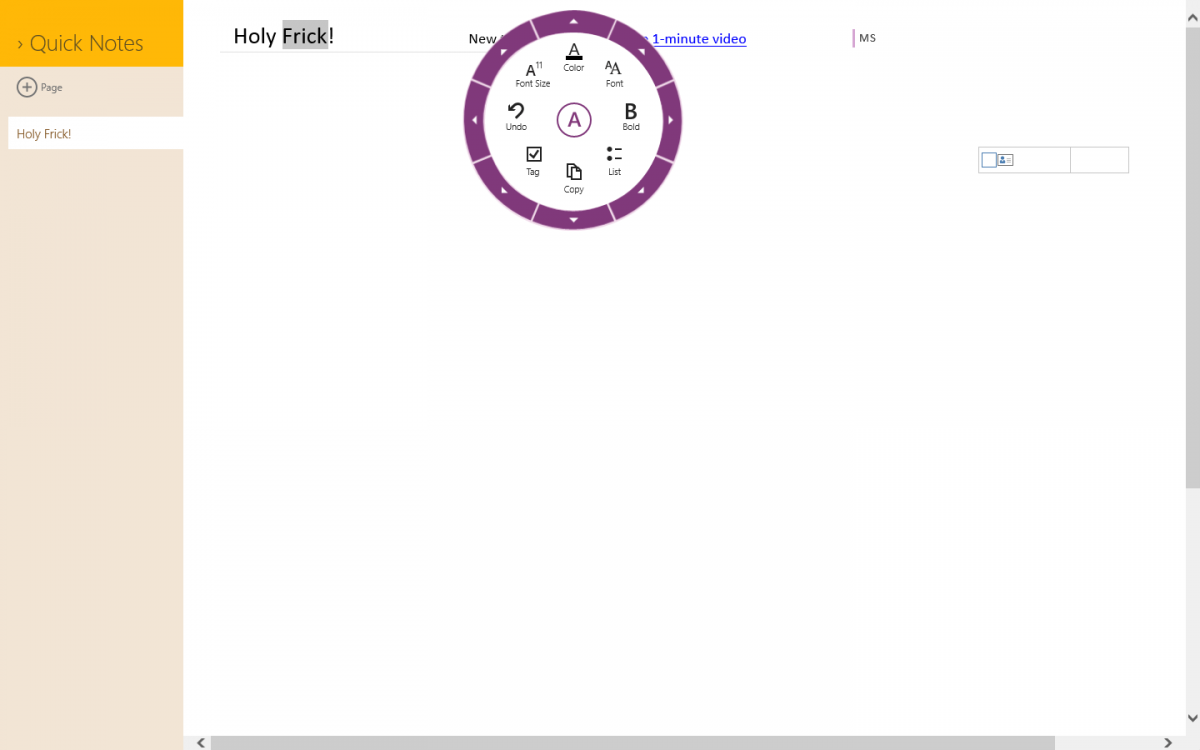
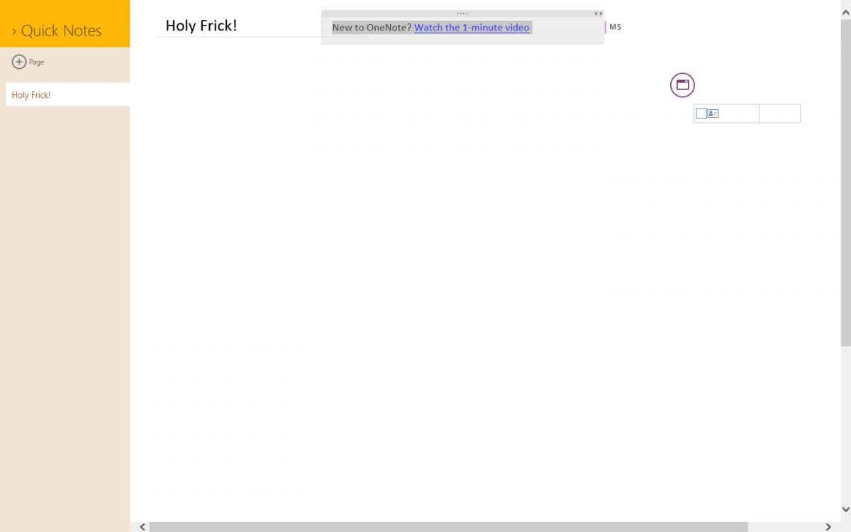
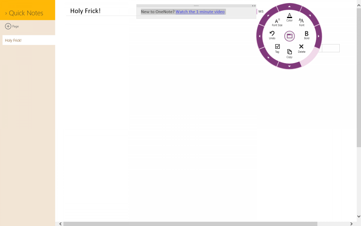
I can see it happening, it will require a new UI design from it is right now, such as Ribbon to Radial menu design. The app command bar won't be used as one, AutoCAD has hundreds and hundreds of commands that will NEVER fit on the app command bar; and two, it will get tedious to do that. The OneNote MX app on Windows 8 has the Radial menu design that works REAL nicely for commands like that. Playing around with it, it is cool. Each Ribbon tab in AutoCAD could be turned into a Radial menu, where all the individual commands within that tab are there.

Screenshot (87).png
Screenshot (88).png
Screenshot (89).png
 

My Computer

System One

  • OS
    Windows 8.1 Pro
    Computer type
    PC/Desktop
    System Manufacturer/Model
    ASUS
    CPU
    AMD FX 8320
    Motherboard
    Crosshair V Formula-Z
    Memory
    16 gig DDR3
    Graphics Card(s)
    ASUS R9 270
    Screen Resolution
    1440x900
    Hard Drives
    1 TB Seagate Barracuda (starting to hate Seagate)
    x2 3 TB Toshibas
    Windows 8.1 is installed on a SanDisk Ultra Plus 256 GB
    PSU
    OCZ 500 watt
    Case
    A current work in progres as I'll be building the physical case myself. It shall be fantastic.
    Cooling
    Arctic Cooler with 3 heatpipes
    Keyboard
    Logitech K750 wireless solar powered keyboard
    Mouse
    Microsoft Touch Mouse
    Browser
    Internet Explorer 11
    Antivirus
    Windows Defender, but I might go back on KIS 2014
I think the Desktop will disappear when most of the "four million desktop apps" used (seems like a high figure to me) are written in the Modern interface. I'm guestimating five years. It will remain a portal to the Modern UI until then.

I still cant see AutoCAD, ArcGIS and a dozen of scientific and math softwares that I use working productively in a Metro interface. I think that five years is a small time frame for that. Don't get me wrong. I like Metro, but there's much to be done in the next years to retire desktop.

All of those would be ideal if redesigned for a modern/touchscreen interface.

AutoCAD especially was designed in the era of nerds with a dogeared copy of Lord of the Rings in their back pocket wishing they could be just like Gandalf and have their supersecret book of spells(commands) that they could wield. Its also why learning the ins and outs of AutoCAD can take a while to master.

It can be very powerful if you do, but the tool would become accessible to a lot more people with a real thoughtout interface. Even these days, CAD tools tend to be constrained by people that cannot think outside of the box of the GIMP desktop interface. Never saw a button they didn't like or a drop-down menu they couldn't pile added features onto.

And of course, every one of them thinks thats the best and only possible way to effectively interact with a tool. Everything else is rubbish of course, but then they've never seen or used better.
 

My Computer

System One

  • OS
    Windows 7 on the desktop, Windows 8 Surface Pro mobile
I think the Desktop will disappear when most of the "four million desktop apps" used (seems like a high figure to me) are written in the Modern interface. I'm guestimating five years. It will remain a portal to the Modern UI until then.

I still cant see AutoCAD, ArcGIS and a dozen of scientific and math softwares that I use working productively in a Metro interface. I think that five years is a small time frame for that. Don't get me wrong. I like Metro, but there's much to be done in the next years to retire desktop.

All of those would be ideal if redesigned for a modern/touchscreen interface.

AutoCAD especially was designed in the era of nerds with a dogeared copy of Lord of the Rings in their back pocket wishing they could be just like Gandalf and have their supersecret book of spells(commands) that they could wield. Its also why learning the ins and outs of AutoCAD can take a while to master.

It can be very powerful if you do, but the tool would become accessible to a lot more people with a real thoughtout interface. Even these days, CAD tools tend to be constrained by people that cannot think outside of the box of the GIMP desktop interface. Never saw a button they didn't like or a drop-down menu they couldn't pile added features onto.

And of course, every one of them thinks thats the best and only possible way to effectively interact with a tool. Everything else is rubbish of course, but then they've never seen or used better.
Holy hell yeah.... AutoCAD takes learning and then a few years to master. But the results are amazing though, it's quite something. It's also like with Photoshop, that and AutoCAD have legitimate college courses in order to master them as they're that intensive.

But if I should say, the Ribbon in AutoCAD SUCKS. There are always without doubt several commands that don't fit within the Ribbon tab, such as Draw. It ends up being a drop down menu of sorts. Then there are the redundant tabs that show up in Home and Annotate, and the others as well.... It's not designed too well I believe. You can't mouse scroll through the tabs, only if you click on one of them and THEN be able to. That's ALWAYS been a pain in my crotch.

I say Radial menu!
 

My Computer

System One

  • OS
    Windows 8.1 Pro
    Computer type
    PC/Desktop
    System Manufacturer/Model
    ASUS
    CPU
    AMD FX 8320
    Motherboard
    Crosshair V Formula-Z
    Memory
    16 gig DDR3
    Graphics Card(s)
    ASUS R9 270
    Screen Resolution
    1440x900
    Hard Drives
    1 TB Seagate Barracuda (starting to hate Seagate)
    x2 3 TB Toshibas
    Windows 8.1 is installed on a SanDisk Ultra Plus 256 GB
    PSU
    OCZ 500 watt
    Case
    A current work in progres as I'll be building the physical case myself. It shall be fantastic.
    Cooling
    Arctic Cooler with 3 heatpipes
    Keyboard
    Logitech K750 wireless solar powered keyboard
    Mouse
    Microsoft Touch Mouse
    Browser
    Internet Explorer 11
    Antivirus
    Windows Defender, but I might go back on KIS 2014
I still cant see AutoCAD, ArcGIS and a dozen of scientific and math softwares that I use working productively in a Metro interface. I think that five years is a small time frame for that. Don't get me wrong. I like Metro, but there's much to be done in the next years to retire desktop.

All of those would be ideal if redesigned for a modern/touchscreen interface.

AutoCAD especially was designed in the era of nerds with a dogeared copy of Lord of the Rings in their back pocket wishing they could be just like Gandalf and have their supersecret book of spells(commands) that they could wield. Its also why learning the ins and outs of AutoCAD can take a while to master.

It can be very powerful if you do, but the tool would become accessible to a lot more people with a real thoughtout interface. Even these days, CAD tools tend to be constrained by people that cannot think outside of the box of the GIMP desktop interface. Never saw a button they didn't like or a drop-down menu they couldn't pile added features onto.

And of course, every one of them thinks thats the best and only possible way to effectively interact with a tool. Everything else is rubbish of course, but then they've never seen or used better.
Holy hell yeah.... AutoCAD takes learning and then a few years to master. But the results are amazing though, it's quite something. It's also like with Photoshop, that and AutoCAD have legitimate college courses in order to master them as they're that intensive.

But if I should say, the Ribbon in AutoCAD SUCKS. There are always without doubt several commands that don't fit within the Ribbon tab, such as Draw. It ends up being a drop down menu of sorts. Then there are the redundant tabs that show up in Home and Annotate, and the others as well.... It's not designed too well I believe. You can't mouse scroll through the tabs, only if you click on one of them and THEN be able to. That's ALWAYS been a pain in my crotch.

I say Radial menu!

You're still thinking inside the box. The box being that you have an object upon which work is to be done, and a set of commands that you can issue to modify it in a desired manner. You can pile those into drop-down menus, Radial Menus, a Ribbon, Buttons on a toolbar, or off a command-line. But you're still providing a static linear set of commands available at all times.

The way a touch and the Modern interface works is that you interact directly(either through touch or mouse) with an object on the right, and you're provided a set of commands and controls based on what you select or what you do on the left. So lets say you select something with a drawing, say a vertex. A vertex isn't an entire object, so what you might want to do with that vertex is limited to those comands which manipulate a vertex. If you selected an entire object, what you might want to do with that object is completely different. The key is to provide a limited list of the most common things you want to do with that vertex or object.

Lets say you select the side of a wireframe cube, a logical command i'll simply pull from my rear would be to add a texture to that side. As i always tell people... touch properly done turns the entire program inside out. In a traditional UI, you issue the command, select a texture, and then the object is the last thing you interact with and you select the side. In a touch UI, you select the side.. are provided the options of what you can do with that side, and then apply a texture.

The reason this is key is that by turning the program inside out, you only have a finite ammount of logical commands that you want to do with any discrete portion of the object that can be selected, and those operations that cannot be done, can be dropped entirely until they are needed. In this way the interface becomes a lot more simplified because you don't have toolbars all over the screen or have to plow down through menus to find the most obvious commands based on what you've selected. At the same time, if you select something on the left.. like Move.. the entire list alters now that it knows that you want to move the object. Based on a path? Free dragging? To a specific location? And so on.

The big problem Modern Interface has is nobody really understands the power of it yet, even most developers. It won't be until they break out of their mind set with some quality Apps and Applications that have been redesigned to use it that people suddenly start to understand exactly why its so groundbreaking. It isn't just for kicks.. it isn't just for show.. it really does provide a far more efficient and easier to understand way of doing things. But programs have to be specifically built for it to really take advantage of what it can actually do.
 

My Computer

System One

  • OS
    Windows 7 on the desktop, Windows 8 Surface Pro mobile
1. Hybrid Boot

Didn't use it (I don't use the old style "Hibernate" either).
It's no better than "Sleep" on a desktop.

When I turn my PC off, I want it off.
I don't want it remembering stuff, like malware that was running (unnoticed) in the RAM.

2. Windows Defender built in

Maybe a benefit, if it is actually the best AV.

3. New Task Manager

Process Explorer is still better.

4. Storage Spaces

Didn't use it.
I don't trust it either (People are still posting comments about problems with Dynamic Discs).

5. Improve system resource management

I have stated many times that W8 has improved resource management (here and on SevenForums).

8. Less dialog box pop ups to confirm if you want to delete a file

That's not an improvement at all.
Vista(?) and W7 got rid of confirmation dialogs for "Read-only" files, which was a stupid idea.

9. File Explorer Ribbon (for those that do a lot of file management, FAR superior than 7, no case or argument)

If you like the "Ribbon".
Let's face it, all that the "Ribbon" does is restore the menus and toolbars, that Vista and Windows 7 inexplicably got rid of (compared to XP).

If you actually do "... a lot of file management, ...", 3rd party file managers are generally superior to Windows/File Explorer.

10. Improved dual monitor support

Debatable.
People are still posting about multi-monitor problems.

11. Much more improved device driver support and installation

Debatable.
People are still posting about driver problems, including drivers that worked in W7.

12. Better file copy times and a new file copy/paste dialog box

I haven't seen the performance comparisons (XP vs Vista vs W7 vs W8) so I can't say either way.
The pretty graph doesn't impress me.

"Pause" is OK though.

13. Native USB 3.0 support

OK.

14. Most flexible UI that all the H8ers out there vehemently do not understand how to use, the Start Screen.

Not an improvement on a desktop without a Touch input device.

It's like trying to use the Android Phone UI on my Nootec A9 Media Box.
It's a nightmare to use with the supplied remote control.
It requires a keyboard and mouse (wireless or USB) connected to be usable (or the optional wireless keyboard with scratchpad).
I suppose you could buy a Touchscreen TV (blech!).
 
Last edited:

My Computer

System One

  • OS
    Windows 7 Ultimate SP1 (64 bit), Linux Mint 18.3 MATE (64 bit)
    Computer type
    PC/Desktop
    System Manufacturer/Model
    n/a
    CPU
    AMD Phenom II x6 1055T, 2.8 GHz
    Motherboard
    ASRock 880GMH-LE/USB3
    Memory
    8GB DDR3 1333 G-Skill Ares F3-1333C9D-8GAO (4GB x 2)
    Graphics Card(s)
    ATI Radeon HD6450
    Sound Card
    Realtek?
    Monitor(s) Displays
    Samsung S23B350
    Screen Resolution
    1920x1080
    Hard Drives
    Western Digital 1.5 TB (SATA), Western Digital 2 TB (SATA), Western Digital 3 TB (SATA)
    Case
    Tower
    Mouse
    Wired Optical
    Other Info
    Linux Mint 16 MATE (64 bit) replaced with Linux Mint 17 MATE (64 bit) - 2014-05-17
    Linux Mint 14 MATE (64 bit) replaced with Linux Mint 16 MATE (64 bit) - 2013-11-13
    Ubuntu 10.04 (64 bit) replaced with Linux Mint 14 MATE (64 bit) - 2013-01-14
    RAM & Graphics Card Upgraded - 2013-01-13
    Monitor Upgraded - 2012-04-20
    System Upgraded - 2011-05-21, 2010-07-14
    HDD Upgraded - 2010-08-11, 2011-08-24,
@ chrisa

Just to let you know that your post didn't get unnoticed. I'm not that knowledgeable to understand all that you said, but I get the gist of it. I don't understand quantum mechanics either, but I know it exists.

I always had a feeling that the "big change" MS made with the new interface was more than what meets the eye. More to it than just "taking our precious Start Menu away". A whole new approach to computing. Rather ingenious IMO.
 

My Computer

System One

  • OS
    8.1 Pro X64
    Computer type
    PC/Desktop
    System Manufacturer/Model
    Acer T690
    CPU
    Intel Pentium D Dual Core
    Motherboard
    Acer/Intel E946GZ
    Memory
    2GB (max upgrade)
    Graphics Card(s)
    Intel Graphics Media Accelerator 3000 - PCI Express x16
    Sound Card
    Integrated RealTek ALC888 high-definition audio with 7.1 channel audio support
    Monitor(s) Displays
    Acer AL1917W A LCD
    Screen Resolution
    1440 X 900
    Hard Drives
    350 GB Seagate Barracuda 7200.10
    Thumb drives
    PSU
    Standard 250 watt
    Case
    Desktop 7.2" (183mm) W x 17.5" (445mm) L x 14.5"
    Cooling
    Dual case fans + CPU fan
    Keyboard
    Acer Windows PS/2
    Mouse
    Wireless Microsoft Arc
    Internet Speed
    54mbp/s
    Browser
    IE11
    Antivirus
    Defender
    Other Info
    Office Pro 2013 / Nokia Lumia 1520 Windows Phone 8.1DP GDR1

My Computer

System One

  • OS
    Vista and Win7
    System Manufacturer/Model
    2xHP, 2xGateway, 1xDell, 1xSony
    Hard Drives
    5 SSDs and 12 HDs
Coke, The Start Menu is symbolical (frankly we can survive without it). But their refusal to bring it back was realy Microsoft's saying "we rule, we decide. You don't".
 

My Computer

System One

  • OS
    w9x
All of those would be ideal if redesigned for a modern/touchscreen interface.

AutoCAD especially was designed in the era of nerds with a dogeared copy of Lord of the Rings in their back pocket wishing they could be just like Gandalf and have their supersecret book of spells(commands) that they could wield. Its also why learning the ins and outs of AutoCAD can take a while to master.

It can be very powerful if you do, but the tool would become accessible to a lot more people with a real thoughtout interface. Even these days, CAD tools tend to be constrained by people that cannot think outside of the box of the GIMP desktop interface. Never saw a button they didn't like or a drop-down menu they couldn't pile added features onto.

And of course, every one of them thinks thats the best and only possible way to effectively interact with a tool. Everything else is rubbish of course, but then they've never seen or used better.
Holy hell yeah.... AutoCAD takes learning and then a few years to master. But the results are amazing though, it's quite something. It's also like with Photoshop, that and AutoCAD have legitimate college courses in order to master them as they're that intensive.

But if I should say, the Ribbon in AutoCAD SUCKS. There are always without doubt several commands that don't fit within the Ribbon tab, such as Draw. It ends up being a drop down menu of sorts. Then there are the redundant tabs that show up in Home and Annotate, and the others as well.... It's not designed too well I believe. You can't mouse scroll through the tabs, only if you click on one of them and THEN be able to. That's ALWAYS been a pain in my crotch.

I say Radial menu!

You're still thinking inside the box. The box being that you have an object upon which work is to be done, and a set of commands that you can issue to modify it in a desired manner. You can pile those into drop-down menus, Radial Menus, a Ribbon, Buttons on a toolbar, or off a command-line. But you're still providing a static linear set of commands available at all times.

The way a touch and the Modern interface works is that you interact directly(either through touch or mouse) with an object on the right, and you're provided a set of commands and controls based on what you select or what you do on the left. So lets say you select something with a drawing, say a vertex. A vertex isn't an entire object, so what you might want to do with that vertex is limited to those comands which manipulate a vertex. If you selected an entire object, what you might want to do with that object is completely different. The key is to provide a limited list of the most common things you want to do with that vertex or object.

Lets say you select the side of a wireframe cube, a logical command i'll simply pull from my rear would be to add a texture to that side. As i always tell people... touch properly done turns the entire program inside out. In a traditional UI, you issue the command, select a texture, and then the object is the last thing you interact with and you select the side. In a touch UI, you select the side.. are provided the options of what you can do with that side, and then apply a texture.

The reason this is key is that by turning the program inside out, you only have a finite ammount of logical commands that you want to do with any discrete portion of the object that can be selected, and those operations that cannot be done, can be dropped entirely until they are needed. In this way the interface becomes a lot more simplified because you don't have toolbars all over the screen or have to plow down through menus to find the most obvious commands based on what you've selected. At the same time, if you select something on the left.. like Move.. the entire list alters now that it knows that you want to move the object. Based on a path? Free dragging? To a specific location? And so on.

The big problem Modern Interface has is nobody really understands the power of it yet, even most developers. It won't be until they break out of their mind set with some quality Apps and Applications that have been redesigned to use it that people suddenly start to understand exactly why its so groundbreaking. It isn't just for kicks.. it isn't just for show.. it really does provide a far more efficient and easier to understand way of doing things. But programs have to be specifically built for it to really take advantage of what it can actually do.
Yeah, which I'm basically saying with the Radian menu. I posted a few screenshots of OneNote MX and its radial menu. You tap or highlight some text, a small circle with an A in it shows up, tap or click that, and text commands appear in the radial. No other commands BUT text manipulation show up. Same thing if you hit a table, you get table commands. There is no Ribbon that has greyed out options or anything, a Radial only shows the relevant commands based upon what is selected by the user. From what you've described, that is essentially how the Radial "menu" design works, if this were a wireframe cube: you select the cube, tap the Radial menu icon that appears, issue the command, apply the texture. Then if you want to modify said texture, tap that, tap the Hatch icon that would show up, modify it.
 

My Computer

System One

  • OS
    Windows 8.1 Pro
    Computer type
    PC/Desktop
    System Manufacturer/Model
    ASUS
    CPU
    AMD FX 8320
    Motherboard
    Crosshair V Formula-Z
    Memory
    16 gig DDR3
    Graphics Card(s)
    ASUS R9 270
    Screen Resolution
    1440x900
    Hard Drives
    1 TB Seagate Barracuda (starting to hate Seagate)
    x2 3 TB Toshibas
    Windows 8.1 is installed on a SanDisk Ultra Plus 256 GB
    PSU
    OCZ 500 watt
    Case
    A current work in progres as I'll be building the physical case myself. It shall be fantastic.
    Cooling
    Arctic Cooler with 3 heatpipes
    Keyboard
    Logitech K750 wireless solar powered keyboard
    Mouse
    Microsoft Touch Mouse
    Browser
    Internet Explorer 11
    Antivirus
    Windows Defender, but I might go back on KIS 2014
Back
Top