How, exactly, is it "horrid"?
It's funny, but every time I ask this question of the start screen haters, all they can do is mumble something about not being designed for a keyboard and mouse, which is patently untrue.
Hi there
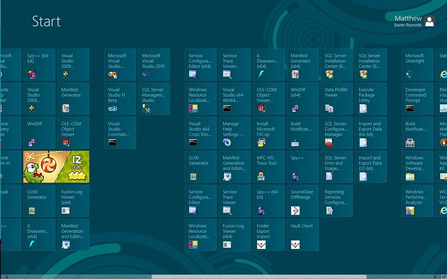
It really is HORRID if you have to endlessly scroll leftwards for about 7 KM to find something -- and if you install an application every wretched little .EXE file creates a stupid tile which can get inserted ANYWHERE on the start screen -- not necessarily within the main application - and often these .exe files aren't actually the executables you want to start anyway. (And please don't say use the SEARCH -- you might not know or can't remember the name - especially if it's a sub application that you don't use very often).
No for anybody who has more than two or three LARGE COMPLEX applications that used to require a lot of SUB menus, SUB SUB menus and even SUB SUB SUB menus in the old classical interface the new Metro one is HORRIBLE, B/S and absolutely NOT DESIGNED for convenient use.
I suspect that there are whole slews of people on this Forum who just can't get it through their brains that some people DO run very complex applications --try installing the full versions of the whole ADOBE CS SUITE together with the FULL version of VISUAL STUDIO and now tell me that the Metro interface is easy to use compared with the old MENU system.
If you have simple applications or not many applications then it's easy to see where you are coming from -- but you need to try installing the LARGE complex applications to UNDERSTAND what a lot of users have difficulty with -- we aren't being perverse --it's just that this NEW interface makes it a pain to organise after W8 is installed and what is frustrating is that a lot of people just can't SEE THIS. (Of course most people don't have the full CS suite or Visual studio installed so they will never get to see what the problem is anyway).
Even on a modest laptop the start screen gets a HIDEOUS mess -- I know it can be (eventually) tidyed up but why should I have to go through all that extra totally UNNECESSARY work just to get a system to work as it USED TO straight out of the box.
Even here scroll towards Infinity (as shown) on screenshot --afraid my infinity symbol isn't too well drawn.
Old menu system handled this MUCH BETTER.
And BTW even on a MOBILE PHONE I get fed up with the tiles if I have to scroll more than about 3 or 4 times so even here once you start adding loads of apps the whole interface isn't really fit for purpose even on THOSE devices either.
Cheers
jimbo