Microsoft Unveils a New Look

6864.Microsoft-Logo.png
It’s been 25 years since we’ve updated the Microsoft logo and now is the perfect time for a change. This is an incredibly exciting year for Microsoft as we prepare to release new versions of nearly all of our products. From Windows 8 to Windows Phone 8 to Xbox services to the next version of Office, you will see a common look and feel across these products providing a familiar and seamless experience on PCs, phones, tablets and TVs. This wave of new releases is not only a reimagining of our most popular products, but also represents a new era for Microsoft, so our logo should evolve to visually accentuate this new beginning.

The Microsoft brand is about much more than logos or product names. We are lucky to play a role in the lives of more than a billion people every day. The ways people experience our products are our most important “brand impressions”. That’s why the new Microsoft logo takes its inspiration from our product design principles while drawing upon the heritage of our brand values, fonts and colors.
The logo has two components: the logotype and the symbol. For the logotype, we are using the Segoe font which is the same font we use in our products as well as our marketing communications. The symbol is important in a world of digital motion (as demonstrated in the video above.) The symbol’s squares of color are intended to express the company’s diverse portfolio of products.
Microsoft Unveils a New Look - The Official Microsoft Blog - Site Home - TechNet Blogs
 
I like it, it's bold, simple, yet symbolic.

Although you do need to see their little video for it to make sense, although they don't seem to be using yellow for anything....I wonder if that represents Bing and their online division.
 

My Computer

System One

  • OS
    Windows 8.1 Pro
    Computer type
    PC/Desktop
    System Manufacturer/Model
    ASUS
    CPU
    AMD FX 8320
    Motherboard
    Crosshair V Formula-Z
    Memory
    16 gig DDR3
    Graphics Card(s)
    ASUS R9 270
    Screen Resolution
    1440x900
    Hard Drives
    1 TB Seagate Barracuda (starting to hate Seagate)
    x2 3 TB Toshibas
    Windows 8.1 is installed on a SanDisk Ultra Plus 256 GB
    PSU
    OCZ 500 watt
    Case
    A current work in progres as I'll be building the physical case myself. It shall be fantastic.
    Cooling
    Arctic Cooler with 3 heatpipes
    Keyboard
    Logitech K750 wireless solar powered keyboard
    Mouse
    Microsoft Touch Mouse
    Browser
    Internet Explorer 11
    Antivirus
    Windows Defender, but I might go back on KIS 2014

My Computer

System One

  • OS
    Windows 10 Education 64 Bit
    Computer type
    PC/Desktop
    System Manufacturer/Model
    Asus
    CPU
    AMD Phenom II X4 980 Black Edition Deneb 3.7GHz
    Motherboard
    ASUS M4N68T-M V2 µATX Motherboard
    Memory
    8GB 4GBx2 Kingston PC10600 DDR3 1333 Memory
    Graphics Card(s)
    NVIDIA Geforce GT640 2 Gig DDR3 PCIe
    Sound Card
    VIA VT1708s High Definition Audio 8-channel Onboard
    Monitor(s) Displays
    22" LG E2242 1080p and 2 19" I-INC AG191D
    Screen Resolution
    1280x1024 - 1920x1080 - 1280x1024
    Hard Drives
    Crucial MX100 256 GB SSD and 500 GB WD Blue SATA
    PSU
    Thermaltake TR 620
    Case
    Power Up Black ATX Mid-Tower Case
    Cooling
    Stock heatsink fan
    Keyboard
    Logitech Wireless K350 Wave
    Mouse
    Logitech M570 Trackball and T650 TouchPad
    Internet Speed
    80 Mbps Down 30 Mbps Up
    Browser
    Internet Explorer 11
    Antivirus
    Windows Defender
    Other Info
    HP DVD1040e Lightscribe - External USB2
Yeah, I know, that's why I couldn't resist posting it. :D
 

My Computer

System One

  • OS
    Windows 10 Education 64 Bit
    Computer type
    PC/Desktop
    System Manufacturer/Model
    Asus
    CPU
    AMD Phenom II X4 980 Black Edition Deneb 3.7GHz
    Motherboard
    ASUS M4N68T-M V2 µATX Motherboard
    Memory
    8GB 4GBx2 Kingston PC10600 DDR3 1333 Memory
    Graphics Card(s)
    NVIDIA Geforce GT640 2 Gig DDR3 PCIe
    Sound Card
    VIA VT1708s High Definition Audio 8-channel Onboard
    Monitor(s) Displays
    22" LG E2242 1080p and 2 19" I-INC AG191D
    Screen Resolution
    1280x1024 - 1920x1080 - 1280x1024
    Hard Drives
    Crucial MX100 256 GB SSD and 500 GB WD Blue SATA
    PSU
    Thermaltake TR 620
    Case
    Power Up Black ATX Mid-Tower Case
    Cooling
    Stock heatsink fan
    Keyboard
    Logitech Wireless K350 Wave
    Mouse
    Logitech M570 Trackball and T650 TouchPad
    Internet Speed
    80 Mbps Down 30 Mbps Up
    Browser
    Internet Explorer 11
    Antivirus
    Windows Defender
    Other Info
    HP DVD1040e Lightscribe - External USB2
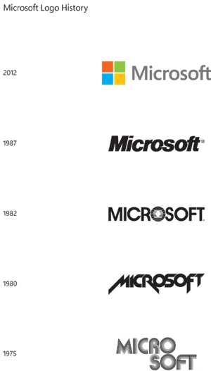
:) Looks like Microsoft has changed over the years... MicrosoftLogoHistory_1_Page.png
 

My Computer

System One

  • OS
    Windows 8 Pro 64-Bit with Media Center
    System Manufacturer/Model
    HP Pavilion Phoenix H9-1060sc
    CPU
    Intel Core i7 (2nd Gen) 2600 / 3.4 GHz
    Motherboard
    IPISB-CH2 (Chicago)
    Memory
    16 GB
    Graphics Card(s)
    Nvidia GeForce GTX 580
    Sound Card
    Integrated IDT 92HD89E Audio
    Monitor(s) Displays
    Samsung 23" SyncMaster SA750D
    Screen Resolution
    1920 x 1080
    Hard Drives
    120 GB Solid State & 2 TB 7200 RPM 3.0 Gb/sec
    PSU
    Internal 600 Watt (100V-240V)
    Case
    HP Tower: Height: 41.3 cm Width: 17.3 cm
I think the logo looks ok. It is slightly bland, though I like the color (May not be so nice in monochrome though).

It could have been worse. SO MUCH worse. Microsoft's last logo was absolutely nothing special. Logos at best are "meh" at worst they are just horrible (Not even talking about 80s chic or anything, but some of the new fad logo designs that just make you groan, is the swirl or swoosh or arch or spiral in this month?)

So because it's not hideous, it's actually pretty good...
 

My Computer

System One

  • OS
    Windows 7/8
Oh Realy, the opposite would have surprised me! LOL
Coke said:
I like it
It's lame, so they don't risk anything (unlike the risk they do by porting their new logo concept across all the UIs of their Windows products) but as FSeal said: it's not hideous, it's actually pretty good. I must say it's a positive surprise indeed.
 

My Computer

System One

  • OS
    w9x
I love Microsoft's logo from 1980, it's like if they were a cover band for Metallica! :p
 

My Computer

System One

  • OS
    Windows 8.1 Pro
    Computer type
    PC/Desktop
    System Manufacturer/Model
    ASUS
    CPU
    AMD FX 8320
    Motherboard
    Crosshair V Formula-Z
    Memory
    16 gig DDR3
    Graphics Card(s)
    ASUS R9 270
    Screen Resolution
    1440x900
    Hard Drives
    1 TB Seagate Barracuda (starting to hate Seagate)
    x2 3 TB Toshibas
    Windows 8.1 is installed on a SanDisk Ultra Plus 256 GB
    PSU
    OCZ 500 watt
    Case
    A current work in progres as I'll be building the physical case myself. It shall be fantastic.
    Cooling
    Arctic Cooler with 3 heatpipes
    Keyboard
    Logitech K750 wireless solar powered keyboard
    Mouse
    Microsoft Touch Mouse
    Browser
    Internet Explorer 11
    Antivirus
    Windows Defender, but I might go back on KIS 2014
I think the logo looks ok. It is slightly bland, though I like the color (May not be so nice in monochrome though).

It could have been worse. SO MUCH worse. Microsoft's last logo was absolutely nothing special. Logos at best are "meh" at worst they are just horrible (Not even talking about 80s chic or anything, but some of the new fad logo designs that just make you groan, is the swirl or swoosh or arch or spiral in this month?)

So because it's not hideous, it's actually pretty good...
You know... I just love it! :) Clear and simple design! That's what I like in it!
 

My Computer

System One

  • OS
    Windows 8 Pro 64-Bit with Media Center
    System Manufacturer/Model
    HP Pavilion Phoenix H9-1060sc
    CPU
    Intel Core i7 (2nd Gen) 2600 / 3.4 GHz
    Motherboard
    IPISB-CH2 (Chicago)
    Memory
    16 GB
    Graphics Card(s)
    Nvidia GeForce GTX 580
    Sound Card
    Integrated IDT 92HD89E Audio
    Monitor(s) Displays
    Samsung 23" SyncMaster SA750D
    Screen Resolution
    1920 x 1080
    Hard Drives
    120 GB Solid State & 2 TB 7200 RPM 3.0 Gb/sec
    PSU
    Internal 600 Watt (100V-240V)
    Case
    HP Tower: Height: 41.3 cm Width: 17.3 cm
While I really appreciate them finally changing the old logo for Microsoft and adopting an symbol/image mark it lacks any sort of brand recognition. First the font they use is the same as their products which is both good and bad it's good because people will associate the font with Microsoft but Segoe also looks like Myriad a font Apple uses so there's the bad in that. Hopefully they've adopted a branding system where the type is always with their image logos for the products. The most important though is the image mark doesn't represent Microsoft. If anything it really represents windows and the image is so plain it could mean anything if not set against the word Microsoft. Without color it becomes even harder to tell what that logo is about. I mean they really should have thought of something better. Yes it's much better than using a slanted sans-serif font as a logo but this really isn't much better. I actually would love for Microsoft to do well but they need to think of a image logo or even a type logo that represents what Microsoft is and since they are trying to tell people they are branching out and more than just an operating system the windows logo is far to plain and giving the audience a conflicted image of the brand. They paid probably a lot for the windows 8 logo and frankly it wasn't that well done.

The logo isn't bad coinciding with their new (and in my opinion badly executed) simple design but the logo should work in only black first and with this logo I don't see it. Office and perhaps xbox have much better designed logos. This is a branding for their WHOLE company they should have come up with something much more recognizable for their brand. Especially since they no longer really have a type logo they really only have the image logo for people to recognize them from. That image could be windows but it could also just be 4 squares in different colors or in just plain flat 1 color just four squares. Apple isn't really much better but at least the image mark they used as their logo looks a bit more distinctive. I'm pretty sure I have seen way more logos of four squares. They should have explored the typography as well so that their type logo came out more interesting. I just think for a representation of Microsoft this makes the company look blah. It reminds me more of the logo for windows or maybe the next version of windows more so than for their company. I'm sure they took a lot of time to think about it but with all the new products and changes they've made especially in the area of design this doesn't represent their company itself all that well.
 

My Computer

As with logos, you really need to examine them in depth rather superficially. Superficially, it looks like they just took their Microsoft Store logos and used that, or used the logo used in a Windows 95 advert, or they just got lazy. You really need to see it in motion to really see it though, like the new Windows logo, press Start and C and the Start button kind of does a little animation, as the metro design is in "motion."

Here's my breakdown.

The four squares seems terribly simple and lacking effort, but as Microsoft is undergoing their minimalist design overhaul, it fits. The four colored squares are in order of the infamous Start logo in Windows or RGBY. It keeps the company at its roots, which is Windows. Without that piece of software, we wouldn't have Xbox, or Windows Phone, or Office, or Bing. Break it down further, you have the four cornerstones of Microsoft: Windows, Office, Xbox, and I'm going out on a limb as to say Bing/online division. ALL of those products have undergone a huge revamp in design this past year and most recently this summer. Windows 8 has been reimagined, Windows Phone 8 is built off Windows shared core of 8 making it a huge change again in Windows Phone, Office has gone through a cloud centric revamp and just a luscious UI, and Bing has been redesigned to be more immersive and more in line with everything else along with Office Web Apps, SkyDrive, ect. To top it off, all of Microsoft's products have a metro/mosaic tile design to them, especially Windows, Windows Phone and Xbox. The four squares, or better yet, tiles, make perfect sense. The cornerstones of what has made Microsoft what it is now and what it is planning for the future is well symbolized with the new logo.

Aw yeah.
 

My Computer

System One

  • OS
    Windows 8.1 Pro
    Computer type
    PC/Desktop
    System Manufacturer/Model
    ASUS
    CPU
    AMD FX 8320
    Motherboard
    Crosshair V Formula-Z
    Memory
    16 gig DDR3
    Graphics Card(s)
    ASUS R9 270
    Screen Resolution
    1440x900
    Hard Drives
    1 TB Seagate Barracuda (starting to hate Seagate)
    x2 3 TB Toshibas
    Windows 8.1 is installed on a SanDisk Ultra Plus 256 GB
    PSU
    OCZ 500 watt
    Case
    A current work in progres as I'll be building the physical case myself. It shall be fantastic.
    Cooling
    Arctic Cooler with 3 heatpipes
    Keyboard
    Logitech K750 wireless solar powered keyboard
    Mouse
    Microsoft Touch Mouse
    Browser
    Internet Explorer 11
    Antivirus
    Windows Defender, but I might go back on KIS 2014
Coke said:
I love Microsoft's logo from 1980, it's like if they were a cover band for Metallica! :p
LOL. But as a logo that's the worse of all. ...and Metallica wasn't around yet in 1980 (they started in 1982 if I recall) Maybe M$ should sue Metallica for stealing their logo design?
Coke said:
Break it down further, you have the four cornerstones of Microsoft: Windows, Office, Xbox, and I'm going out on a limb as to say Bing/online division. ALL of those products have undergone a huge revamp in design this past year and most recently this summer. Windows 8 has been reimagined, Windows Phone 8 is built off Windows shared core of 8 making it a huge change again in Windows Phone, Office has gone through a cloud centric revamp and just a luscious UI, and Bing has been redesigned to be more immersive and more in line with everything else along with Office Web Apps, SkyDrive, ect. To top it off, all of Microsoft's products have a metro/mosaic tile design to them, especially Windows, Windows Phone and Xbox. The four squares, or better yet, tiles, make perfect sense.
Excellent analysis, Coke. And since I'm in the Metro basher/whiner/moaner bandwagon (LOL) I'll add that I don't even need to test W8, I don't even need to see snapshots on the internet, the logo suffices to take the decision not to upgrade! (yeah, I'm an a**, I know) :D
 

My Computer

System One

  • OS
    w9x
I respect your opinion. But, to say I am only looking at it superficially is incorrect. How it looks is as important as the message itself. I know the reason why they have created this logo. I'm not saying their idea is wrong. It's what they've done. While they are moving towards tiles this logo could frankly be a logo for anything. You are right you'd have to see it in motion but that's the problem you won't be seeing it in motion when you are looking at the logo unless it's a video or animation. What happens when it is static? Logos need to work when it's just static and in only black and white(even in greyscale the image loses much of their ideas). What happens to people that can't see color etc? People need to be able to recognize it but right now that logo could be any number of companies if not set next to the text "Microsoft". I'm sure designers went through many ideas. I've gone through a bunch of ideas for logos before myself.

They could have done something to suggest motion since it wouldn't be in motion. More importantly, it doesn't represent the whole company. While windows is their most well known product it becomes as if windows is what the designers are creating the logo for. Even though I don't like the windows 8 logo since it looks as if it could be the Finland/Sweden flag but at least they gave it motion and perspective. I get the idea they are going for however it doesn't represent them as a company. Logos should be simple but unique and represent their brand. I don't see how tiles and squares is the only way to represent their brand. It represents one of their products. They were in a position to re-brand themselves and do something great for their brand. This logo isn't bring interest the way the office logo does or bring brand recognition or represent whatever Microsoft is supposed to mean or stand for.
 

My Computer

Change is always good as far as I am concerned, might not be the best in the world but it's better than nothing and at least it's better than being stuck in the past :)
 

My Computer

System One

  • OS
    windows 7
Back
Top