Anywork is done on Font Smoothing from Microsoft?

corei5

New Member
Messages
11
Hi,

I'm having a great despair towards the fact that font smoothing in Windows family (especially the last 2 iterations of the family: windows 7 & 8) will remain less than its competitor, the OS X OS, for a very long time. Does anyone knows if Microsoft takes care of this font smoothing problem or not? I installed Office 2013 on Windows 7 and the fonts look so bad even when using MacType. The switch to a mac is very expensive for me so I'm still waiting impatiently for Microsoft to give this problem a great deal of care and cure but it seems like I'm waiting for ever :(

I've read news on the internet on different websites about Windows 8 will make support for retina displays (which will become the norm in next years) but I feel like all of these news were fake as Windows 8 has been released with fonts look even more crappy than before!:cry:
 

My Computer

System One

  • OS
    Windows 7 x64
    Computer type
    PC/Desktop
    CPU
    Core i5 - Stock Speed
    Motherboard
    Gigabyte GA-UD3P
    Memory
    8 GB
    Graphics Card(s)
    ATI Radeon HD 5450
    Monitor(s) Displays
    Samsung SyncMaster S22B300
    Screen Resolution
    1920*1080
    Browser
    Firefox
    Antivirus
    Avast
Hi there
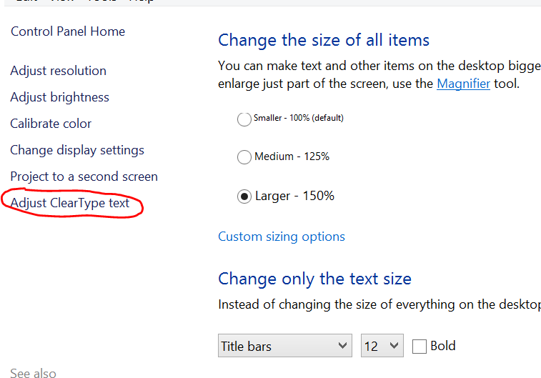
I think you can install loads of user fonts if you want to -- also see if enabling CLEAR Type renders the fonts better . Note also resolution of monitor and graphic card can also play a part in font rendering. You can also change default fonts if some render better on your system than others.

To tune clear type go into control panel==>personalisation==>display.

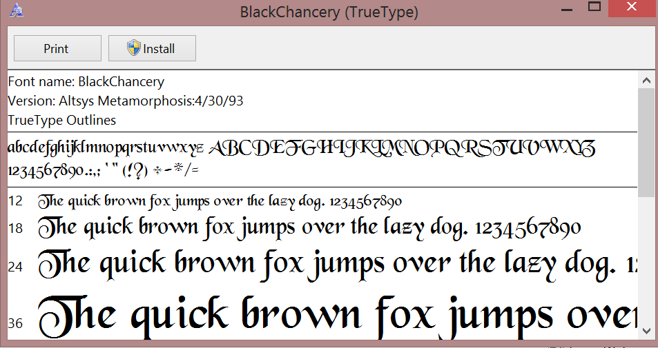
As far as user fonts are concerned there's loads of Free TTF fonts all over the web - just download any you like and install

Here's one I like that I've been using almost since Windows 95 days.

screenshots enc.

Cheers
jimbo
 

Attachments

  • clear.png
    clear.png
    13.2 KB · Views: 169
  • chancery.png
    chancery.png
    25.5 KB · Views: 267

My Computer

System One

  • OS
    Linux Centos 7, W8.1, W7, W2K3 Server W10
    Computer type
    PC/Desktop
    Monitor(s) Displays
    1 X LG 40 inch TV
    Hard Drives
    SSD's * 3 (Samsung 840 series) 250 GB
    2 X 3 TB sata
    5 X 1 TB sata
    Internet Speed
    0.12 GB/s (120Mb/s)
Hi corei5

Are you using the native resolution on your monitor?

The native resolution is usually the highest resolution (largest numbers) available in your graphics properties.

Fonts, and graphics will not render properly at any other resolution.
 

My Computer

System One

  • OS
    Windows 8.1 & W10 Tech Priview
    Computer type
    Laptop
    System Manufacturer/Model
    Dell 15R
    CPU
    Intell i3
    Internet Speed
    6 Mbps
    Browser
    Chrome
    Antivirus
    Windows Defender
Yes I'm using the native resolution of my LCD 22 inch monitor and cleartype tweaking is pretty useless. I strongly believe it's the technology itself is lagging behind in comparison to OSX rendering (that's what my eyes can see anyway). Hopefully, I'll switch to the MAC in the near future. Enough for Windows at this point!
 

My Computer

System One

  • OS
    Windows 7 x64
    Computer type
    PC/Desktop
    CPU
    Core i5 - Stock Speed
    Motherboard
    Gigabyte GA-UD3P
    Memory
    8 GB
    Graphics Card(s)
    ATI Radeon HD 5450
    Monitor(s) Displays
    Samsung SyncMaster S22B300
    Screen Resolution
    1920*1080
    Browser
    Firefox
    Antivirus
    Avast
The rendering of Clear Type text in Internet Explorer is done using monochrome, instead of using coloured pixels. In other words, a simple antialiasing technique, instead of Clear Type is used. Heavens knows why, unless it just squeezes a jot more speed out of the slow display in IE. The same, inferior, rendering engine is used for many Windows apps, mail and some other Microsoft software products.

Firefox, Chrome, and other third party browsers use the standard polychrome Clear Type algorithm that is used for the system (Explorer, Notepad etc.) in Windows back to XP, and look perfect. Use the magnifier tool in ease of access accessories to see the problem in detail. See here for a detailed description of Sub-Pixel Rendering (Clear Type).

The standard rendering version looks fine, even at 67%, but the IE version only looks OK at larger scales - on big monitors, or when zoomed past 100%.

Microsoft support seems blind to the issue which has presented in IE for versions back to 6.

Try Internet Explorer blurry text as search terms in Google, and time after time Microsoft help support fails to grasp the issue. Even IE 10 has the problem.

Microsoft would probably have you use the same size and sort of monitors they give to their development and support staff, or look at your screen through a smear of fingerprints as on a Surface.
 

My Computer

System One

  • OS
    Windows 8.1 Pro with Media Center
    Computer type
    PC/Desktop
    System Manufacturer/Model
    HP COMPAQ Presario CQ57
    CPU
    AMD E- 300 APU with Radion HD Graphics 1.30GHz
    Motherboard
    inbuilt
    Memory
    4GB
    Graphics Card(s)
    ATI
    Sound Card
    High Definition Audio on-board
    Monitor(s) Displays
    notebook
    Screen Resolution
    1366x768
    Hard Drives
    Seagate ST9500325AS
    Google drive 15GB
    Skydrive 25GB
    BT Cloud
    PSU
    external 20v
    Case
    Laptop
    Cooling
    pretty good
    Keyboard
    inbuilt
    Mouse
    touchpad
    Internet Speed
    BT Infinity Unlimited - 80 up 20 down =70/16 really
    Browser
    Chrome Canary usually
    Antivirus
    Windows Defender and Malwarebytes
    Other Info
    no Start menu modifications
    Upgraded with no issues to 8.0 and to 8.1
it's not about how OSX is rendering it. In fact, OS X has no special rendering technology. they use 1440x900 as their reference resolution for UI and font scaling. every resolution supported by the Mac and iOS is an even multiple of this. this is why Macs have weird resolutions like 2880x1800 or 2048x1536. Apple says this is what they want and their manufacturers have to follow.

Of course, Windows isn't like that. Windows tries to be everything to all hardware. Windows tries to accommodate all. Whether you have a 1600x1200 monitor, or a 1280x800 monitor or a 1920x1080 HDTV or a 1440x900 panel or a 1366x768 panel, Windows will render according to nearly any resolution you choose. This results in some scaling problems.

It's also a problem because some of the software makers are not making use of the newer APIs out there that support the newer rendering available. And the older the software you use, the worse the problem is (because of course, the software was programmed before the newer APIs were available to use).
 

My Computer

System One

  • OS
    Windows 8.1 Pro
it's not about how OSX is rendering it. In fact, OS X has no special rendering technology. they use 1440x900 as their reference resolution for UI and font scaling. every resolution supported by the Mac and iOS is an even multiple of this. this is why Macs have weird resolutions like 2880x1800 or 2048x1536. Apple says this is what they want and their manufacturers have to follow.

Of course, Windows isn't like that. Windows tries to be everything to all hardware. Windows tries to accommodate all. Whether you have a 1600x1200 monitor, or a 1280x800 monitor or a 1920x1080 HDTV or a 1440x900 panel or a 1366x768 panel, Windows will render according to nearly any resolution you choose. This results in some scaling problems.

It's also a problem because some of the software makers are not making use of the newer APIs out there that support the newer rendering available. And the older the software you use, the worse the problem is (because of course, the software was programmed before the newer APIs were available to use).

Hi there
I'm trying to replicate your problem --on TWO monitors I'm using I have to almost go as low resolution to 640 X 480 to get hideously ugly fonts -- and on a 40 inch screen this is almost at the pixel level. !!

I find it's usually Linux desktops / GUI's that require degrees of "Font de-uglification" to be done. However since I usually run Linux as a server in the Command line mode it's not an issue.

Any chance of posting a screen shot of your "Ugly font" -- to avoid "Double font" rendering use the PRINT SCREEN feature and paste into Ms Word --then use the snipping tool to snip the image from the word document and post that. It should give a more accurate rendering than if you use the snipping tool directly for this exercise.

BTW CHANGE the standard Tahoma font to something else --this font is known to look horrible on some monitors.

Cheers
jimbo
 

My Computer

System One

  • OS
    Linux Centos 7, W8.1, W7, W2K3 Server W10
    Computer type
    PC/Desktop
    Monitor(s) Displays
    1 X LG 40 inch TV
    Hard Drives
    SSD's * 3 (Samsung 840 series) 250 GB
    2 X 3 TB sata
    5 X 1 TB sata
    Internet Speed
    0.12 GB/s (120Mb/s)
Back
Top